4 posts on Product Design

A framework for User-Centered Decisions

24 min read 0 comments Report broken page
TBD: Lacks a conclusion, illustrations, and examples.

I was recently asked to describe the guiding principles I would use to weigh three different solutions to a specific user pain point, with an emphasis on the user/customer. There are typically other factors to consider, such as engineering effort, business goals, etc., but these were out of scope in that particular case.

Since most prioritization frameworks include a user-centered / impact component, the framework discussed here can complement them nicely, by simply replacing some of the factors with its outcome. For example, if using RICE, you can use this framework to calculate R×I, then proceed to multiply by C/E as usual (being mindful of units).

The Three Axes

Utility and Usability (which Nielsen groups under Usefulness) are considered the core pillars of Product-led Growth. However, both Utility and Usability are short-term metrics and do not consider the bigger picture, so only using them as a compass could result in short-sightedness. I think there is also a third axis, which I call Evolution, and refers to how well a feature fits into the bigger picture, by examining how it relates to the product’s past and (especially) future.

Alt text

  1. Utility (aka Impact): How many use cases and user pain points does it address, how well, and how prominent are they?
  2. Usability: How easy is it to use? Evaluating usability at the idea stage is tricky, as overall usability will vary depending on how each idea is implemented, and there is often a lot of wiggle room within the same idea. At this stage, we are only concerned with aspects of usability inherent in the idea itself.
  3. Evolution: How does it relate to features that we have shipped in the past and features we may ship in the future? Being mindful of this prevents feature creep and ensures the mental models exposed via the UI remain coherent.

These are not entirely independent, there are complex interplays between them:

  • Evolution affects Usability: Features that fit poorly into the product’s past and future will create later usability issues. However, treating it as a separate factor helps us catch these issues much earler, and at the right conceptual level.
  • Utility and Usability can often be at odds: the more powerful a feature is, the more challenging it is to make it usable.

Now let’s discuss each axis in more detail.

Utility

Utility measures the value proposition of a feature for users. It can be further broken down to:

  • Raising the ceiling: What becomes possible? Does it enable any use cases for which there is no workaround?
  • Lowering the floor: What becomes easier? Does it provide a better way to do something for which there is already a workaround? How big is the delta?
  • Widening the walls: Does it serve an ignored audience or market? Does it broaden the set of use cases served by the product?
  • Use Case Significance: How important are the use cases addressed?

While this applies more broadly, it is particularly relevant and top priority for creative tools.

In evaluating the overall Utility of an idea, it can often be helpful to list primary and secondary use cases separately, and evaluate Significance for them separately.

Primary & Secondary use cases

Primary use cases are those for which a solution is optimal (or close), and have often been the driving use cases behind its design. This is to contrast with secondary use cases, for which a solution is a workaround. Another way to frame this is friction: How much friction does the solution involve for each use case? For primary use cases, that should be close to 0, whereas for secondary use cases it will be higher.

A good design will ideally have a healthy amount of both. Lack of secondary use cases could hint that the feature may be overly tailored to specific use cases (overfitting).

The north star goal should obviously be to address all use cases head-on, with zero friction. But since resources are finite, enabling workarounds buys us time. There is far less pressure to solve a use case for which there is a workaround, than one that is not possible at all. The latter contributes to churn far more directly.

It is not unheard of to ship a feature with a low number of primary use cases, simply because it has a high number of secondary use cases, and will buy us time to work on better solutions for them. In these cases, Evolution is even more important: when we later have addressed all these use cases head-on, does this feature still serve a purpose?

Use Case Significance

This is a rough measure of how important the features addressed are. This needs to be evaluated holistically: an incremental improvement for a common interaction is far more impactful than a substantial improvement for a niche use case.

Some ways to reason about it may be:

  • Frequency: How frequently do these use cases come up in a single user journey?
  • Reach: What percentage of users do they affect?
  • Criticality: How much do they matter to users? Are they a nice-to-have or a dealbreaker?
  • Vision: How do the use cases relate to the software’s high level goals?

Vision may at first seem more related to the business than the user. However, when software design loses sight of its vision, the result can be a confusing, cluttered user experience that doesn’t cater to any use case well.

Usability

There are many ways to break usability down into independent, quantifiable dimensions. I generally go with a tweaked version of the one I first learned at MIT’s UI Design & Implementation course I took in 2016 (and then taught in 2018 and replaced in 2020 😅), bringing it one step closer to the original Nielsen dimensions by re-adding Satisfaction:

  1. Learnability: How easy is it for users to understand?
  2. Efficiency: Once learned, is it fast to use?
  3. Safety (aka Errors): Are errors few and recoverable?
  4. Satisfaction: How pleasant is it to use?

Some examples of usability considerations and how they relate to these dimensions:

Learnability

  • Compatibility: Does it re-use existing concepts or introduce new ones?
  • Internal Consistency: How consistent is it with the way the rest of the product works?
  • External Consistency: How consistent is it with the environment (other products, related domains, etc.)?
  • Memorability: When users return to the design after a period of not using it, how easily can they reestablish proficiency?

Efficiency

  • Speed: How many steps does it take to accomplish a task and how long does each step take?
  • Cognitive Load: How much mental effort does it require?
  • Physical Load: How much physical effort does it require?

Safety

  • Error-proneness: How hard is it for users to make mistakes?
  • Error severity: How severe are the consequences of mistakes?
  • Recoverability: How easy is it to recover from mistakes?

Satisfaction

  • Aesthetics: How visually pleasing is it?
  • Ergonomics: How comfortable is it to use?
  • Enjoyment: How fun is it to use?

Satisfaction is a bit of an oddball. First, it has limited applicability to certain types of UIs, e.g. non-interactive text-based UIs (programming languages, APIs, etc.). Even where it applies, it can be harder to quantify. But most importantly, when deciding between ideas there is rarely enough signal to gauge satisfaction. If it’s not helpful for your use case, just leave it out.

Each idea will rarely have universally worse or better usability than another. More commonly, it will be better in some dimensions and worse in others. To evaluate these tradeoffs, we need to understand the situation and the user.

The situation

“Situation” here refers to the use case plus its context.

The more repetitive or common the task, the higher the importance of Efficiency. For example text entry is an area where efficiency needs to be optimized down to individual keystrokes or minute pointing movements. On the other end of the spectrum, for highly infrequent tasks, users don’t have time to develop transferable knolwedge across uses and thus Learnability is very important (e.g. tax software, visa applications). Last, the more there is at stake, the more important Safety becomes. Some examples of cases where Safety is top priority would be missile launches, airplane navigation, healthcare software on a macro scale, or privacy, data integrity, finances on a micro scale.

There is granularity here as well. For example, a visa application is used infrequently enough that learnability matters far more than efficiency for the product in general. However, if it includes a question where it expects the user to enter their last 20 international trips, efficiency for trip entry is important.

Sometimes, two factors may genuinely be equally important. Consider a stock trading program used on a daily basis by expert traders. Lost seconds translate to lost dollars, but mistakes also translate to lost dollars. Is Efficiency or Safety more important?

Note that there are also interplays between different dimensions: the more effort a task involves (efficiency), the more high stakes a mistake is perceived to be (safety). You have likely experienced this: a lengthy form losing your answers feels a lot more frustrating than having to re-enter your email in a login form.

The user

As a general rule of thumb, novices need learnability whereas for experts other dimensions of usability are more important. But who is an expert? Expert in what?

Application expertise is orthogonal to domain expertise. Tax software for accountants needs good learnability in terms of application features, but can assume familiarity with tax concepts (but not necessarily recall). Conversely, tax software for regular taxpayers needs both: as software that is typically only used once a year, learnability in terms of application features is top priority. But abstracting and simplifying tax concepts is also important, as most users are not very proficient in them.

Generally speaking, the more we can rely on training, the less important learnability becomes. This is why airplane cockpits are so complex: pilots have spent years of training learning to use these UIs, so efficiency and safety are prioritized instead (or at least should be — sadly that is not always the case).

That said, there is often an opportunity for disruption here, by taking a product that has the potential to bring value to many but currently requires lengthy training, and creating one that requires little to none. Creator tools are prime candidates for this, with no-code/low-code tools being a flagship example right now. However, almost every mainstream technology went through this kind of democratization at some point: computers, cameras, photo editing, video production, etc.

This distinction does not only apply to the product as a whole, but also individual product areas. For example, an onboarding flow needs to prioritize learnability regardless of the priorities of the rest of the product.

Evolution

Evolution is a bigger picture measure of how well a proposed feature fits into the product’s past, present and future, with an emphasis on the latter, since relationship to the past and present is also the Internal Consistency component of Learnability.

When evaluating compatibility with potential future evolution, it’s important to not hold back. Ten years down the line, when today’s implementation constraints, technology limitations, or resource limits are no more, what would we ship and how does this feature relate to it? Does it have a place in that future, is it entirely unnecessary, or — worse — does it actively conflict with it?

This is to avoid feature creep by ensuring that features are not designed ad hoc, but they contribute towards a coherent conceptual design.

The most common way for a feature to connect to the product’s past, present, and future is by being a milestone across a certain axis of progress:

  • Level of abstraction (See Layering):
    • Is it a shortcut to a present or future lower level primitive?
    • Is it a lower level primitive that explains existing functionality?
  • Power: Is it a less powerful version of a future feature?
  • Granularity: Is it a less granular version of a future feature?

If we have a north star UI, part of this is to consider whether a proposed feature is compatible with it or actively diverges.

A feature could also be entirely orthogonal to all existing features and still be a net win wrt Evolution. For example, when it helps us streamline UX by allowing us to later remove another feature that has been problematic.

Weighing tradeoffs

While all three are very important, they are not equally important. In broad strokes, usually, Utility > Usability > Evolution. Here’s why:

  • Utility > Usability: If a product does not provide value, people leave, even if it provides a fantastic user experience for the few and/or niche use cases it actually serves.
  • Usability > Evolution, since Evolution is a long-term / more speculative concern, whereas Usability a more immediate / higher confidence one.

Depending on the product and the environment however, this trend could be reversed:

  • Competition: If a product is competing in a space where use cases are already covered very well, but by products with poor usability, Usability becomes more important. In fact, many successful products were actually usability innovations: The Web, Dropbox, the iPhone, Zoom, and many others.
  • Mutability: Change is always hard, but for some products it’s a lot harder, making a solid Evolution path more important. Web technologies are an extreme example: it is almost impossible to remove or change anything, ever, as there are billions of uses in the wild, no way to migrate them, and no control over them. Instead, changes have to be designed as new technologies or additions to existing ones.
  • Complexity: The more complexity increases, the more important it becomes to keep further increase at bay, so Evolution becomes more important.

Ok, now make the darn decision already!

So far we’ve discussed various tradeoffs, so it may be unclear how to use this as a framework to make actual decisions.

Decision-making itself also involves tradeoffs: adding structure makes it easier to decide, but consumes more time. To balance this, I tend to favor an iterative approach, adding more precision and structure if the previous step failed to provide enough clarity. For simple, uncontroversial decisions, just discussing the three axes can be sufficient, and the cost-benefit of more structure is not worth it. But for more complex higher stakes decisions, a more structured approach can pay off.

Let’s consider the goals for any scoring framework:

  1. Compare and contrast: Make an informed decision between alternatives without being lost in the complexity of their tradeoffs.
  2. Drive consensus: It is often easier for a team to agree on a rating or weight for an individual factor, than the much bigger decision of which option to go with.
  3. Communicate: Provide a way to communicate the decision to stakeholders, so they can understand the rationale behind it.

Calculating things precisely (e.g. use case coverage, significance, reach etc.) is rarely necessary for any of them, and thus not a good use of time. Remember that the only purpose of scores is to help us compare alternatives. They have no meaning outside of that context. In the spirit of an iterative approach, start with a simple 1-5 score for each factor, and only add more granularity and/or precision if that does not suffice for converging to a decision.

We can use three tables, one for each factor, with a row for each idea. Then the columns are:

Utility
  • Primary use cases
  • Secondary use cases
  • Utility Score (1-5)
Usability
  • Learnability
  • Efficiency
  • Safety
  • Usability Score (1-5)
Evolution
  • Past & Present
  • Future
  • Evolution Score (1-5)

We fill in the freeform columns first, which should then give us a pretty clear picture of the score for each factor.

Finally, using the 3:2:1 ratio mentioned above, the overall score would be:

Overall_Score=3⋅Utility_Score+2⋅Usability_Score+1⋅Evolution_Score3+2+1

Template: User-Centered Decision Worksheet

I have set up a Coda template for this, which you can copy and fill in with your own data.

Why Coda instead of something like Google Docs or Google Sheets?

  • I don’t have to repeat each idea in the multiple tables, I can set them up as views and they update automatically
  • Rich text (lists, etc) within table cells make it easier to brainstorm
  • One-click rating widgets for scores (great when iterating)
  • I can output the overall score for each feature with a formula, and it updates automatically. No need to clumsily copy-paste it across cells either, I can just define it once for the whole column. I can even use controls for the weights that are outside the table entirely.
  • This may be subjective, but I find Coda docs more well designed than any alternative I’ve tried.
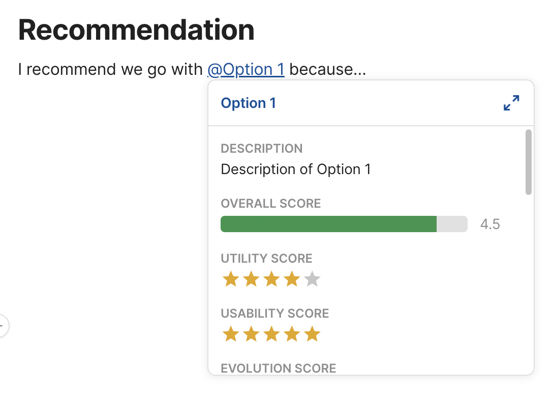
Screenshot of Coda tooltip

As a bonus, I can then even @-mention each feature in the rest of the doc, and hovering over it shows a tooltip with all its metadata!
Product, Product Design, User Centered Design, Decision Making, Prioritization
Edit post on GitHub

Tradeoff scorecard: The ultimate decision-making framework

5 min read 0 comments Report broken page

Every decision we make involves weighing tradeoffs, whether that is done consciously or not. From evaluating whether an extra bedroom is worth $800 extra in rent, whether being able to sleep lying down during a long flight is worth the $500 upgrade cost, to whether you should take a pay cut for that dream job.

For complex high-stakes decisions involving many competing tradeoffs, trying to decide with your gut can be paralyzing. The complex tradeoffs that come up when designing products [1] fall in that category so frequently that analytical decision-making skills are considered one of the most important skills a product manager can have. I would argue it’s a bit broader: analytical decision-making is one of the most useful skills a human can have.

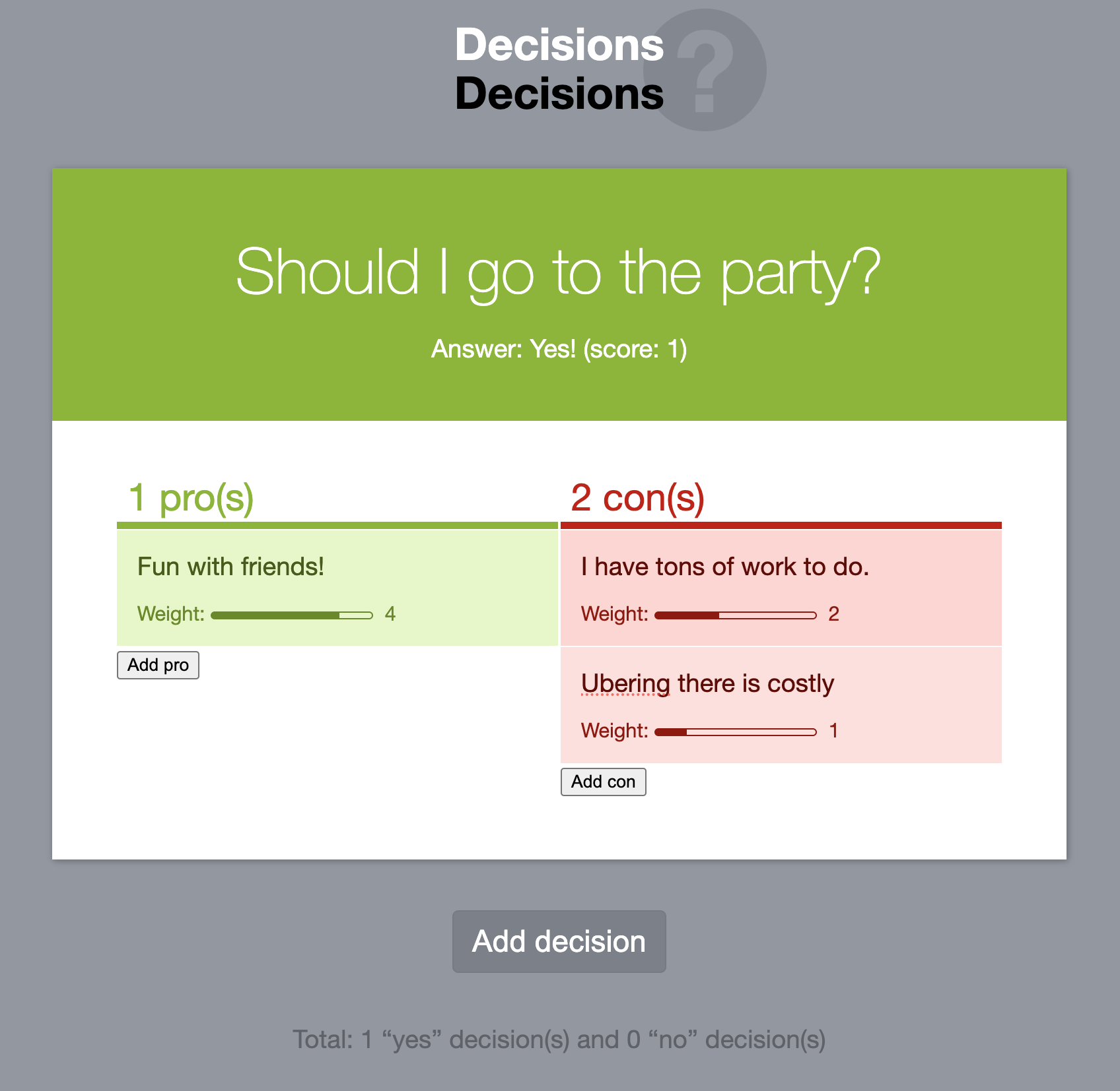
Structured decision-making is a passion of mine (perhaps as a coping mechanism for my proneness to analysis paralysis). In fact, one of the very first demos of Mavo (the novice programming language I designed at MIT) was a decision-making tool for weighed pros & cons. It was even one of the two apps our usability study participants were asked to build during the first Mavo study. I do not only use the techniques described here for work-related decisions, but for any decision that involves complex tradeoffs (often to the amusement of my friends and spouse).

Screenshot of the Decisions Mavo app

The Decisions Mavo app, one of the first Mavo demos, is a simple decision-making tool for weighed pros & cons.

Before going any further, it is important to note a big caveat. Decision-making itself also involves tradeoffs: adding structure makes decisions easier, but consumes more time. To balance this, I tend to favor an iterative approach, adding more precision and structure only if the previous step failed to provide clarity. Each step progressively builds on the previous one, minimizing superfluous effort.

For very simple, uncontroversial decisions, just discussing or thinking about pros and cons can be sufficient, and the cost-benefit of more structure is not worth it. Explicitly listing pros and cons is probably the most common method, and works well when consensus is within reach and the decision is of moderate complexity. However, since not all pros and cons are equivalent, this delegates the weighing to your gut. For more complex or controversial decisions, there is value in spending the time to also make the weighing more structured.

The tradeoff scorecard

What is a decision matrix?

A decision matrix, also known as a scorecard, is a table with options as rows and criteria as columns, with a column in the end that calculates a score for each option based on the criteria. These are useful both for selection, as well as prioritization, where the score is used for ranking options. In selection use cases, the columns can be specific to the problem at hand, or predefined based on certain principles or factors, or a mix of both. Prioritization tends to use predefined columns to ensure consistency. There is a number of frameworks out there about what these columns should be and how to calculate the score, with RICE (Reach × Impact × Confidence / Effort) likely being the most popular.

The Tradeoff Scorecard is not a prioritization framework, but a decision-making framework for choosing among several options.

Qualitative vs. quantitative tradeoffs

Typically, tradeoffs fall in two categories:

  • Qualitative: Each option either includes the tradeoff or it doesn’t. Thing of them as tags that you can add or remove to each option.
  • Quantitative: The tradeoff is associated with a value (e.g. price, effort, number of clicks, etc.)

Not all tradeoffs are all equal. Even for qualitative tradeoffs, some are more important than others, and the differences can be quite vast. Some strengths may be huge advantages, while others minor nice-to-haves. Similarly, some weaknesses can be dealbreakers, while others minor issues.

We can model this by assigning a weight to each tradeoff (typically a 1-5 or 1-10 integer). But if quantitative tradeoffs have a weight, doesn’t that make them quantitative? The difference is that the weight applies to the tradeoff itself, and is applied the same to each each option, whereas the value of quantitative tradeoffs quantifies the relationship between tradeoff and option and thus, is different for each. Note that quantitative tradeoffs also have a weight, since they also don’t all matter the same.

In diagrammatic form, it looks a bit like this: Simplified UML-like diagram showing that each tradeoff has a weight, but the relationship between option and quantitative tradeoff also has a value

These categories are not set in stone. It is quite common for qualitative tradeoffs to become quantitative down the line as we realize we need more granularity. For example, you may start with “Poor discoverability” as a qualitative tradeoff, then realize that there is enough variance across options that you instead need a quantitative “Discoverability” factor with a 1-5 rating. The opposite is more rare, but it’s not unheard of to realize that a certain factor does not have enough variance to be worth a quantitative tradeoff and instead should be modeled as 1-2 qualitative tradeoffs.

The overall score of each option is the sum of the scores of each individual tradeoff for that option. The score of each tradeoff is often simply its weight multiplied by its value, using 1/-1 as the value of qualitative tradeoffs (pro = 1, con = -1).

While qualitative tradeoffs are either pros or cons, quantitative tradeoffs may not be universally positive or negative. For example, consider price: a low price is a strength, but a high price is a weakness. Similarly, effort is a strength when low, but a weakness when high. Calculating a score for these types of tradeoffs can be a bit more involved:

  • For ratings, we can subtract the midpoint and use that as the value. E.g. by subtracting 3 from a 1-5 rating we get value from -2 to 2. Adjust accordingly if you don’t want the switch to happen in the middle.
  • For less constrained values, such as prices, we can use the value’s percentile instead of the raw number.

Explicit vs implicit tradeoffs

When listing pros and cons across many choices, have you noticed that there is a lot of repetition? First, several options share the same pros and cons, which is expected, since they are alternative solutions to the same problem. But also because pros and cons come in pairs. Each strength has a complementary weakness (which is the absence of that strength), and vice versa.

For example, if one UI option involves a jarring UI shift (a bad thing), the presence of this is a weakness, but its absence is a strength! In other words, each qualitative tradeoff is present on all options, either as a strength or as a weakness. The decision of whether to pick the strength or the weakness as the primary framing for each tradeoff is often based on storytelling and/or minimizing effort (which one is more common?). A good rule of thumb is to try to avoid negatives (e.g. instead of listing “no jarring UI shift” as a pro, list “jarring UI shift” as as con).

It may seem strange to view it this way, but imagine you were trying to compare and contrast five different ideas, three of which involved a jarring UI shift. You would probably list “no jarring UI shifts” as a pro for the other two, right?

This realization helps cut the amount of work needed in half: we simply assume that for any tradeoff not explicitly listed, its opposite is implicitly listed.

Putting it all together

Your choice of tool can make a big difference to how easy this process is. In theory, we could model all tradeoffs as a classic decision matrix, with a column for each tradeoff. Quantitative tradeoffs would correspond to numeric columns, while qualitative tradeoffs would correspond to boolean columns (e.g. checkboxes).

Indeed, if all we have is a grid-based tool (e.g. spreadsheets), we may be stuck doing exactly that. It does have the advantage that it makes it trivial to convert a qualitative tradeoff to a quantitative one, but it can be very unwieldy to work with.

If our tool of choice supports lists within cells, we can do better. These boolean columns can be combined into one column as a list of all relevant tradeoffs. Then, a separate table can be used to define weights for each tradeoff (and any other metadata, e.g. optional notes).

I currently use Coda for these tradeoff scorecards. While not perfect, it does support lists in cells, and has a few other features that make working with tradeoff scorecards easier:

  • Thanks to its relation concept, the list of tradeoffs can be actually linked to their definitions. This means that hovering over each tradeoff displys a popup with its metadata, and that I can add tradeoffs by selecting them from a popup menu.
  • Conditional formatting allows me to color-code tradeoffs based on their type (strength/weakness or pro/con) and weight (lighter color for smaller impact).
  • Its formula language allows me to show and list the implicit tradeoffs for each option (though there is no way to have them be color-coded too).

There are also limitations however:

  • While I can apply conditional formatting to color-code the opposite of each tradeoff, I cannot display implicit tradeoffs as nice color-coded chips, in the same way as explicit tradeoffs, since relations can only display the primary column.
  • Weights for quantitative tradeoffs have to be baked in the formula (there are some ways to make them editable, but )

  1. I use product in the general sense of a functional entity designed to fulfill a specific set of needs or solve particular problems for its users. This does not only include commercial software, but also things like web technologies, open source libraries, and even physical products. ↩︎


Evolution: The missing component of Product-Led Growth

6 min read 0 comments Report broken page
TBD: Lacks a conclusion, illustrations, and examples.

What is Product-Led Growth?

In the last few years, Product-Led Growth has seen a meteoric rise in popularity. The idea is simple: instead of relying on sales and marketing to acquire users, you build a product that sells itself. As a usability advocate, this makes me giddy: Prioritizing user experience is now a business strategy, with senior leadership buy-in!

NN/G considers Utility and Usability the core components of Product-led Growth, which Nielsen groups under a single term: Usefulness. Utility refers to how many use cases are addressed, how well, and how significant these use cases are. If you thought that sounds very much like the RI in RICE, you’d be right, they are indeed roughly the same concept, from a different perspective. Usability, as you probably know, refers to how easy the product is to use, and can be further broken down into individual components, such as Learnability, Efficiency, Safety, and Satisfaction.

Indeed, maximizing Utility and Usability are crucial for creating products that add value. However, both suffer from the same flaw: they are short-term metrics, and do not consider the bigger picture over time. It’s like playing chess while only thinking about the next move. You could be making excellent choices on each turn and still lose the game. Great Utility and Usability alone do not prevent feature creep. We can still end up with a convoluted user experience that lacks a coherent conceptual model; all it takes is enough time.

Therefore, I think there is also a third component, which I call Evolution. Evolution refers to how well a feature fits into the bigger picture of a product, by examining how it relates to its past, present and future (or, more accurately, its various possible futures). By prioritizing features higher when they are part of a trajectory or greater plan and deprioritizing those that are designed ad hoc we can limit complexity, avoid feature creep, and ensure we are moving towards a coherent conceptual design.

Introducing entirely new concepts is not an antipattern by any means, that’s how products evolve! However, it should be done with caution, and the bar to justify such features should be much higher.

The three axes are not entirely independent. Evolution will absolutely eventually affect Usability. The whole point of treating Evolution as a separate axis is that this allows us to catch these issues early and prevent them in the making. By the time conceptual design issues create usability problems, it’s often too late. The changes required to fix the underlying design are a lot more substantial and costly.

The weight of Evolution

The importance of Evolution was really drilled into me while designing web technologies, i.e. the technologies implemented in browsers that web developers use to develop websites and web applications. We do not have a name for it, but the consideration is very high priority when designing any feature for the Web.

In general, Utility and Usability matter more than Evolution. Just like in chess, the next move is far more important than any subsequent move. The argument this post is making is that we should look further than the current roadmap, not that we should stop looking at what’s right in front of us. However, there are some cases where Evolution may become equally important as the other two, or even more.

Low mutability is one such case. Change is always hard, but for some products it’s a lot harder. Web technologies are an extreme example, where you can never remove or change anything. There are billions of uses in the wild, that you have no control over, and no way to migrate users. You cannot risk breaking the Web. Instead, changes must be designed as either additions to existing technologies, or (if substantial enough) as entirely new technologies. The best you can hope for is that if you deprecate the old technology, and you heavily promote the new one, over many years usage of the old technology will drop below the usage threshold that allows considering removal (< 0.02%!). I have often said that web standards work is “product work on hard mode”, and this is one of the reasons. If you do product work, pause for a moment and consider this: How much harder would shipping be if you knew you could never remove or change anything?

Another case is high complexity. Many things that are complex today began as simple things. The cost of adding features without validating their Evolution story is increasing complexity. To some degree, complexity is the fate of every successful product, but being deliberate about adding features can curb the rate of increase. Evolution tends to become higher priority as a product matures. This is artificial: keeping complexity at bay is just as important in the beginning, if not more. However, it is often easier to see in retrospect, after we’ve already felt the pain of increasing complexity.

The value of a North Star UI

In evaluating Evolution for a feature, it’s useful to have alignment on what our “North Star UI(s)” might be.

A North Star UI is the ideal UI for addressing a set of use cases and pain points in a perfect world where we have infinite resources and no practical constraints (implementation difficulty, performance, backwards compatibility, etc.). Sure, many problems are genuinely so hard that even without constraints, the ideal solution is still unknown. However, there many cases where we know exactly what the perfect solution would be, but it’s simply not feasible, so we need to keep looking.

In these cases, it’s useful to document this “North Star UI” and ensure there is consensus around it. You can even do usability testing (using wireframes or prototypes) to validate it.

Why would we do this for something that’s not feasible? First, it can still be useful as a guide to steer us in the right direction. Even if you can’t get all the way there, maybe you can close enough that the remaining distance won’t matter. And in the process, you may find that the closer you get, the more feasible it becomes.

Second, it ensures team alignment, which is essential when trying to decide what compromises to make. How can we reach consensus on the right tradeoffs if we are not even aligned on what the solution would be if we didn’t have to make any compromises?

Third, it builds team momentum. Doing usability testing on a prototype can do wonders for getting people on board who may have previously been skeptical. I would strongly advise to include engineers in this process, as engineering momentum can literally make the difference between what is possible and what is not.

Last, I have often seen “unimplementable” solutions become implementable later on, due to changes in internal or external factors, or simply because a brilliant engineer had a brilliant idea that made the impossible, possible. In my 11 years of designing web technologies, I have seen this happen so many times, I now interpret “cannot be done” as “really hard — right now”.

Mini Case study 1: CSS Nesting Syntax

My favorite example, and something I’m proud to have personally helped drive is the current CSS Nesting syntax, now shipped in every browser. We had plenty of signal for what the optimal syntax was for users (North Star UI), but it had been vetoed by engineering across all major browsers due to prohibitive performance, so we had to design around certain parsing constraints. The original design was quite verbose, actively conflicted with the NSUI syntax, and had poor compatibility with another related feature (@scope). Instead of completely diverging, I proposed a syntax that was a subset of our NSUI, just more explicit in some (common) cases. Originally discussed as “Lea’s proposal”, it was later named “Non-letter start proposal” but became known as Option 3 from its position among the five options considered. After some intense weighing of tradeoffs and several user polls and surveys, the WG resolved to adopt that syntax.

Once we got consensus on that, I started trying to get people on board to explore ways (and brainstorm potential algorithms) to bridge the gap. A few other WG members joined me, with my co-TAG member Peter Linss perhaps being most vocal. We initially faced a lot of resistance from browser engineers, until eventually a couple Chrome engineers closed on a way to implement the north star syntax 🎉, and as they say, the rest is history.

It was not easy to get there, and required weighing Evolution as a factor. There were diverging proposals that in some ways had better syntax than that intermediate milestone. If we only looked at the next move, if we had only used Utility and Usability to guide us, we would have made a suboptimal long-term decision.

Evaluating Evolution

To evaluate Utility, we can look at the use cases a feature addresses, and how significant they are. Evaluating Usability is also a matter of evaluating its individual components, such as Learnability, Efficiency, Safety, and Satisfaction. This can be done via usability testing, or heuristic evaluation, and ideally both. But how do we evaluate Evolution for a proposed feature?

How well it fits with the product’s past and present overlaps with Usabilty (through Internal Consistency, a component of Learnability), but is also important to consider.

When evaluating how well a feature fits into the product’s future, we can use the north star UI if we have one, as well as other related features that could plausibly be shipped in the future (e.g. have already been discussed, or are natural evolutions of existing features).

Does this feature connect to the product’s past, present, and future across a certain axis of progress? For example:

  • Level of abstraction (See Layering):
    • Is it a shortcut to a present or future lower level primitive?
    • Is it a lower level primitive that explains existing functionality?
  • Power: Is it a less powerful version of a future feature?
  • Granularity: Is it a less granular version of a future feature?

Other considerations:

  • Opportunity cost: What does introducing this feature prevent us from doing in the future?
  • Simplification: What does it allow us to remove?
TBD: Lacks a conclusion, illustrations, and examples.

What is a North Star UI and how can it help product design?

4 min read 0 comments Report broken page

Product deisgn of any kind (including web standards and no/low-code tools, where the bulk of my product design experience comes from) involves a lot of problem solving and balancing constraints and tradeoffs. A tool I have found useful in this process is the concept of a “North Star UI”. I have often mentioned this concept in discussions, and it seemed to be generally understood. However, a a quick google search revealed that outside of this blog, there are only a couple mentions of the term across the entire web, and the only definition was a callout in my Eigensolutions essay. That needed to be fixed!

What is a North Star UI?

A North Star UI is the ideal UI for addressing a set of pain points and use cases in a perfect world with no practical constraints. It’s about answering the question: If we had infinite resources, and implementation difficulty, performance, backwards compatibility, etc. did not matter, what solution would we ship?.

As we will see, there are several benefits to finding that North Star UI, documenting it, and getting consensus around it. You can even do usability testing (using wireframes or prototypes) to validate it.

But why would we spend precious resources on something that’s not feasible?

Benefits of a North Star UI

It simplifies problem solving

As the name implies, one of the primary benefits of a North Star UI is that it can serve as a guide to steer us in the right direction. Even if we can’t get all the way there, maybe we can close enough that the remaining distance won’t matter. And in the process, you may even find that the closer you get, the more feasible it becomes.

For many problems, it is obvious what the NSUI is, and the crux of the problem is weaving through the various practical constraints. In other cases, even without practical constraints, it is not obvious what the solution would be. The concept is useful in both cases, but even more so in the latter as it separates concerns, which can help break down a complex problem into more manageable components:

  1. What is the ideal solution?
  2. What prevents us from getting there?
  3. What compromises can get us close?

Once we have a NSUI, we can use it to evaluate proposed solutions: How do they relate to a future where the NSUI is implemented? Are they a milestone along that path, a parallel path, or do they actively prevent us from implementing it?

Collaboration benefits

A NSUI can be helpful in getting team alignment, which is essential when trying to decide what compromises to make. How can we reach consensus on the right tradeoffs if we are not even aligned on what the solution would be if we didn’t have to make any compromises?

Doing usability testing on a NSUI prototype can build momentum both within a team, and especially across teams. This is assuming the testing revealed that the NSUI is indeed a good user experience; if not, then it’s not a NSUI (or there were flaws in the testing). Having stakeholders sit through user testing sessions can work wonders for getting them on board, especially if they have previously been skeptical.

This can be especially useful for convincing engineers that a certain solution is worth the implementation cost. Many engineers have never learned usability principles, or seen usability testing in action (it doesn’t help that HCI courses in most CS curricula are elective). Engineers are not automatons that will blindly implement whatever they are told to. It is not enough to get them to reluctantly agree to implement something; helping them see the value can get them excited, which makes a world of difference. Engineering momentum can literally make the difference between what is possible and what is not.

Tomorrow’s constraints may be different

Last, I have often seen “unimplementable” solutions become implementable down the line, due to changes in internal or external factors, or simply because someone had a brilliant idea that made the impossible, possible. In my 11 years of designing web technologies, I have seen this happen so many times, I now interpret “cannot be done” as “really hard — right now”.

Case studies

Below I discuss two distinctly different case studies from the last year, where the concept of a North Star UI was instrumental in getting us to a good solution, but through different paths in each.

CSS Nesting Syntax

My favorite example, and something I’m proud to have personally helped drive is the current CSS Nesting syntax, now shipped in every browser. We had plenty of signal for what the optimal syntax was for users (North Star UI), but it had been vetoed by engineering across all major browsers due to prohibitive performance, so we had to design around certain parsing constraints. The original design was quite verbose, actively conflicted with the NSUI syntax, and had poor compatibility with another related feature (@scope). Instead of completely diverging, I proposed a syntax that was a subset of our NSUI, just more explicit in some (common) cases. Originally discussed as “Lea’s proposal”, it was later named “Non-letter start proposal” but became known as Option 3 from its position among the five options considered. After some intense weighing of tradeoffs and several user polls and surveys, the WG resolved to adopt that syntax.

Once we got consensus on that, I started trying to get people on board to explore ways (and brainstorm potential algorithms) to bridge the gap. A few other WG members joined me, with my co-TAG member Peter Linss perhaps being most vocal. We initially faced a lot of resistance from browser engineers, until eventually a couple Chrome engineers closed on a way to implement the north star syntax 🎉, and as they say, the rest is history.

It was not easy to get there, and required weighing Evolution as a factor. There were diverging proposals that in some ways had better syntax than that intermediate milestone. If we only looked at the next move, if we had only used Utility and Usability to guide us, we would have made a suboptimal long-term decision.

State of HTML Sentiment Chips UI

This spun out as a separate case study about this challenge.

In this case, it took until the usability study to get consensus that what I thought was a NSUI was indeed a NSUI. But even if there were, engineering had all but vetoed it. By prototyping it anyway, and demonstrating that it was indeed a superior user experience by testing it with actual users, I was able to get everyone on board. If we had simply ruled it out as “not feasible”, we would have ended up with a suboptimal solution.

Product, Product Design, User Centered Design, Product-Led Growth, North Star UI, Collaboration
Edit post on GitHub