10 posts on HTML

State of HTML 2023 now open!

4 min read 0 comments Report broken page

tl;dr the brand new State of HTML survey is finally open!

Take State of HTML 2023 Survey

Benefits to you:

  • Survey results are used by browsers to prioritize roadmaps — the reason Google is funding this. Time spent thoughtfully filling them out is an investment that can come back to you tenfold in the form of seeing features you care about implemented, browser incompatibilities being prioritized, and gaps in the platform being addressed.
  • In addition to browsers, several standards groups are also using the results for prioritization and decision-making.
  • Learn about new and upcoming features you may have missed; add features to your reading list and get a list of resources at the end!
  • Get a personalized score and see how you compare to other respondents
  • Learn about the latest trends in the ecosystem and what other developers are focusing on

While the survey will be open for 3 weeks, responses entered within the first 9 days (until October 1st) will have a much higher impact on the Web, as preliminary data will be used to inform Interop 2024 proposals.
State of HTML 2023 Logo

The State of HTML logo, designed by Chris Kirk-Nielsen, who I think surpassed himself with this one!

Background

This is likely the most ambitious Devographics survey to date. For the past couple of months, I’ve been hard at work leading a small product team spread across three continents (2am to 8am became my second work shift 😅). We embarked on this mission with some uncertainty about whether there were enough features for a State of HTML survey, but quickly found ourselves with the opposite problem: there were too many, all with good reasons for inclusion! To help weigh the tradeoffs and decide what makes the cut we consulted both the developer community, as well as stakeholders across browsers, standards groups, community groups, and more.

We even designed new UI controls to facilitate collecting the types of complex data that were needed without making the questions too taxing, and did original UX research to validate them. Once the dust settles, I plan to write separate blog posts about some of these.

FAQ

Can I edit my responses?

Absolutely! Do not worry about filling it out perfectly in one go. If you create an account, you can edit your responses for the whole period the survey is open, and even split filling it out across multiple devices (e.g. start on your phone, then fill out some on your desktop, etc.) Even if you’re filling it out anonymously, you can still edit responses on your device for a while. You could even start anonymously and create an account later, and your responses will be preserved (the only issue is filling it out anonymously, then logging in with an existing account).

So, perhaps the call to action above should be


Start State of HTML 2023 Survey

Why are there JS questions in an HTML survey?

For the same reason there are JS APIs in the HTML standard: many JS APIs are intrinsically related to HTML. We mainly included JS APIs in the following areas:

  • APIs used to manipulate HTML dynamically (DOM, form validation, etc.)
  • Web Components APIs, used to create custom HTML elements
  • APIs used to create web apps that feel like native apps (e.g. Service Workers, Web App Manifest, etc.)

If you don’t write any JS, we absolutely still want to hear from you! In fact, I would encourage you even more strongly to fill out the survey: we need to hear from folks who don’t write JS, as they are often underrepresented. Please feel free to skip any JS-related questions (all questions are optional anyway) or select that you have never heard these features. There is a question at the end, where you can select that you only write HTML/CSS:
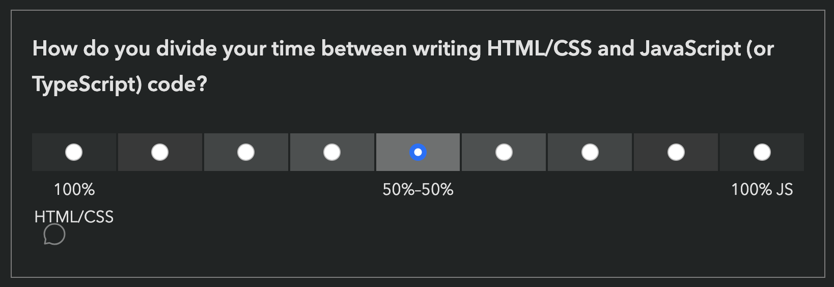
Question about HTML/CSS and JS balance

Is the survey only available in English?

Absolutely not! Localization has been an integral part of these surveys since the beginning. Fun fact: Nobody in the core State of HTML team is a native English speaker.

Screenshot showing dozens of languages

Each survey gets (at least partially) translated to over 30 languages.

However, since translations are a community effort, they are not necessarily complete, especially in the beginning. If you are a native speaker of a language that is not yet complete, please consider helping out!

What does my score mean?

Previous surveys reported score as a percentage: “You have heard or used X out of Y features mentioned in the survey”. This one did too at first:
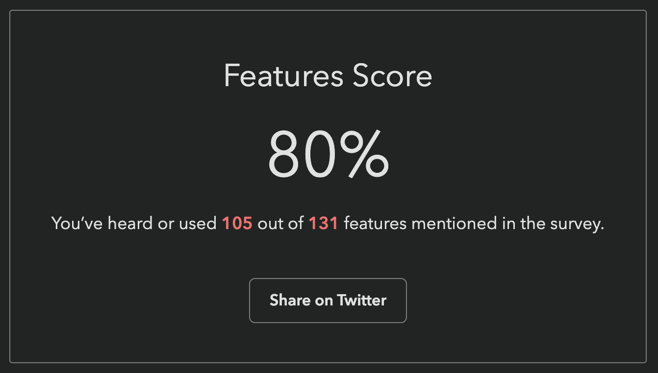
80% score, 105/131 heard or used

This was my own score when the survey first launched, and I created the darn survey 😅 Our engineer, Sacha who is also the founder of Devographics got 19%!

These were a lot lower for this survey, for two reasons:

  1. It asks about a lot of cutting edge features, more than the other surveys. As I mentioned above, we had a lot of difficult tradeoffs to make, and had to cut a ton of features that were otherwise a great fit. We err’ed on the side of more cutting edge features, as those are the areas the survey can help make the most difference in the ecosystem.
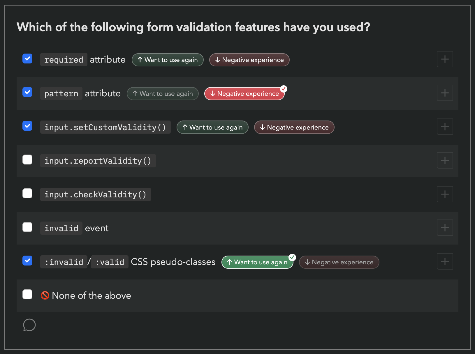
  2. To save on space, and be able to ask about more features, we used a new compact format for some of the more stable features, which only asks about usage, not awareness. Here is an example from the first section of the survey (Forms): Form validation question screenshot However, this means that if you have never used a feature, it does not count towards your score, even if you have been aware of it for years. It therefore felt unfair to many to report that you’ve “heard or used” X% of features, when there was no way to express that you have heard 89 out of 131 of them!
To address this, we changed the score to be a sum of points, a bit like a video game: each used feature is worth 10 points, each known feature is worth 5 points.

Since the new score is harder to interpret by itself and only makes sense in comparison to others, we also show your rank among other participants, to make this easier.
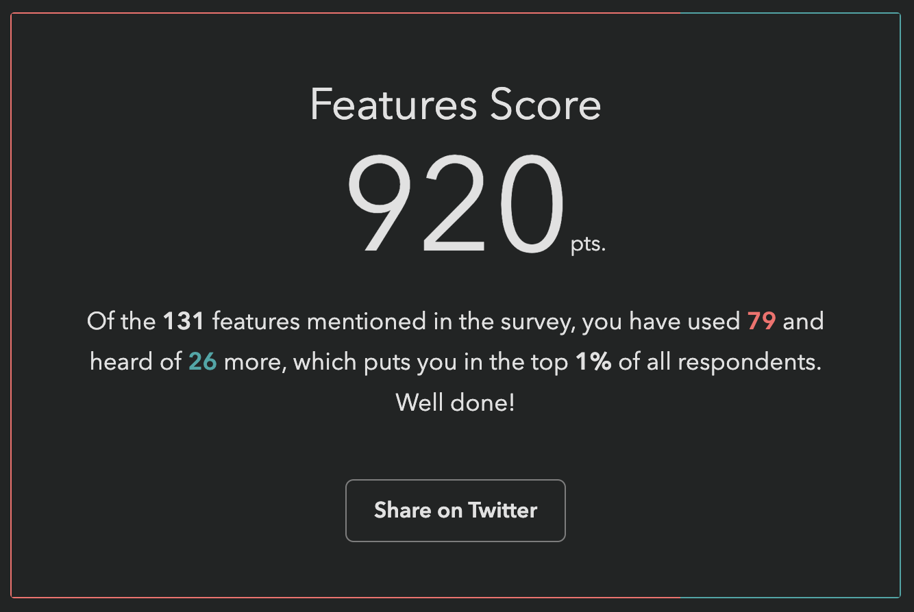
920 pts score, used 79 features out of 131, heard of 26 more

My score after the change. If you have already taken the survey, you can just revisit it (with the same device & browser if filled it in anonymously) and go straight to the finish page to see your new score and ranking!

I found a bug, what should I do?

Please file an issue so we can fix it!

Acknowledgements

This survey would not have been possible without the hard work of many people. Besides myself (Lea Verou), this includes the rest of the team:

  • Engineering team: Sacha Greif, Eric Burel
  • UX research & data science team: Shaine Rosewel Matala, Michael Quiapos, Gio Vernell Quiogue
  • Our logo designer, Chris Kirk-Nielsen

And several volunteers:

  • LĂ©onie Watson for accessibility feedback
  • Our usability testing participants
  • 
and all folks who provided early feedback throuhgout the process

Last but not least, Kadir Topal made the survey possible in the first place, by proposing it and securing funding from Google.

Thank you all! đŸ™đŸŒ

Press coverage (selected)

You still haven’t started the State of HTML 2023 survey?!


Help Design the Inaugural State of HTML Survey!

4 min read 0 comments Report broken page

You have likely participated in several Devographics surveys before, such as State of CSS, or State of JS. These surveys have become the primary source of unbiased data for the practices of front-end developers today (there is also the Web Almanac research, but because this studies what is actually used on the web, it takes a lot longer for changes in developer practices to propagate).

You may remember that last summer, Google sponsored me to be Survey Design Lead for State of CSS 2022. It went really well: we got 60% higher response rate than the year before, which gave browsers a lot of actionable data to prioritize their work. The feedback from these surveys is a prime input into the Interop project, where browsers collaborate to implement the most important features for developers interoperably.

So this summer, Google trusted me with a much bigger project, a brand new survey: State of HTML!

Continue reading


On ratings and meters

2 min read 0 comments Report broken page

I always thought that the semantically appropriate way to represent a rating (e.g. a star rating) is a <meter> element. They essentially convey the same type of information, the star rating is just a different presentation.

An example of a star rating widget, from Amazon

However, trying to style a <meter> element to look like a star rating is 
tricky at best. Not to mention that this approach won’t even work in Shadow trees (unless you include the CSS in every single shadow tree).

So, I set out to create a proper web component for star ratings. The first conundrum was, how does this relate to a <meter> element?

  • Option 1: Should it extend <meter> using builtin extends?
  • Option 2: Should it use a web component with a <meter> in Shadow DOM?
  • Option 3: Should it be an entirely separate web component that just uses a meter ARIA Role and related ARIA attributes?

Continue reading


The failed promise of Web Components

4 min read 0 comments Report broken page

Web Components had so much potential to empower HTML to do more, and make web development more accessible to non-programmers and easier for programmers. Remember how exciting it was every time we got new shiny HTML elements that actually do stuff? Remember how exciting it was to be able to do sliders, color pickers, dialogs, disclosure widgets straight in the HTML, without having to include any widget libraries?

The promise of Web Components was that we’d get this convenience, but for a much wider range of HTML elements, developed much faster, as nobody needs to wait for the full spec + implementation process. We’d just include a script, and boom, we have more elements at our disposal!

Or, that was the idea. Somewhere along the way, the space got flooded by JS frameworks aficionados, who revel in complex APIs, overengineered build processes and dependency graphs that look like the roots of a banyan tree.

This is what the roots of a Banyan tree look like. Photo by David Stanley on Flickr (CC-BY).

Perusing the components on webcomponents.org fills me with anxiety, and I’m perfectly comfortable writing JS — I write JS for a living! What hope do those who can’t write JS have? Using a custom element from the directory often needs to be preceded by a ritual of npm flugelhorn, import clownshoes, build quux, all completely unapologetically because “here is my truckload of dependencies, yeah, what”. Many steps are even omitted, likely because they are “obvious”. Often, you wade through the maze only to find the component doesn’t work anymore, or is not fit for your purpose.

Besides setup, the main problem is that HTML is not treated with the appropriate respect in the design of these components. They are not designed as closely as possible to standard HTML elements, but expect JS to be written for them to do anything. HTML is simply treated as a shorthand, or worse, as merely a marker to indicate where the element goes in the DOM, with all parameters passed in via JS. I recall a wonderful talk by Jeremy Keith a few years ago about this very phenomenon, where he discussed this e-shop Web components demo by Google, which is the poster child of this practice. These are the entire contents of its <body> element:

<body>
	<shop-app unresolved="">SHOP</shop-app>
	<script src="node_assets/@webcomponents/webcomponentsjs/webcomponents-loader.js"></script>
	<script type="module" src="src/shop-app.js"></script>
	<script>window.performance&&performance.mark&&performance.mark("index.html");</script>
</body>

If this is how Google is leading the way, how can we hope for contributors to design components that follow established HTML conventions?

Jeremy criticized this practice from the aspect of backwards compatibility: when JS is broken or not enabled, or the browser doesn’t support Web Components, the entire website is blank. While this is indeed a serious concern, my primary concern is one of usability: HTML is a lower barrier to entry language. Far more people can write HTML than JS. Even for those who do eventually write JS, it often comes after spending years writing HTML & CSS.

If components are designed in a way that requires JS, this excludes thousands of people from using them. And even for those who can write JS, HTML is often easier: you don’t see many people rolling their own sliders or using JS-based ones once <input type="range"> became widely supported, right?

Even when JS is unavoidable, it’s not black and white. A well designed HTML element can reduce the amount and complexity of JS needed to a minimum. Think of the <dialog> element: it usually does require *some* JS, but it’s usually rather simple JS. Similarly, the <video> element is perfectly usable just by writing HTML, and has a comprehensive JS API for anyone who wants to do fancy custom things.

The other day I was looking for a simple, dependency free, tabs component. You know, the canonical example of something that is easy to do with Web Components, the example 50% of tutorials mention. I didn’t even care what it looked like, it was for a testing interface. I just wanted something that is small and works like a normal HTML element. Yet, it proved so hard I ended up writing my own!

Can we fix this?

I’m not sure if this is a design issue, or a documentation issue. Perhaps for many of these web components, there are easier ways to use them. Perhaps there are vanilla web components out there that I just can’t find. Perhaps I’m looking in the wrong place and there is another directory somewhere with different goals and a different target audience.

But if not, and if I’m not alone in feeling this way, we need a directory of web components with strict inclusion criteria:

  • Plug and play. No dependencies, no setup beyond including one <script> tag. If a dependency is absolutely needed (e.g. in a map component it doesn’t make sense to draw your own maps), the component loads it automatically if it’s not already loaded.
  • Syntax and API follows conventions established by built-in HTML elements and anything that can be done without the component user writing JS, is doable without JS, per the W3C principle of least power.
  • Accessible by default via sensible ARIA defaults, just like normal HTML elements.
  • Themable via ::part(), selective inheritance and custom properties. Very minimal style by default. Normal CSS properties should just “work” to the the extent possible.
  • Only one component of a given type in the directory, that is flexible and extensible and continuously iterated on and improved by the community. Not 30 different sliders and 15 different tabs that users have to wade through. No branding, no silos of “component libraries”. Only elements that are designed as closely as possible to what a browser would implement in every way the current technology allows.

I would be up for working on this if others feel the same way, since that is not a project for one person to tackle. Who’s with me?

UPDATE: Wow this post blew up! Thank you all for your interest in participating in a potential future effort. I’m currently talking to stakeholders of some of the existing efforts to see if there are any potential collaborations before I go off and create a new one. Follow me on Twitter to hear about the outcome!


Never forget type="button" on generated buttons!

2 min read 0 comments Report broken page

I just dealt with one of the weirdest bugs and thought you may find it amusing too.
In one of my slides for my upcoming talk “Even More CSS Secrets”, I had a Mavo app on a <form>, and the app included a collection to quickly create a UI to manage pairs of values for something I wanted to calculate in one of my live demos. A Mavo collection is a repeatable HTML element with affordances to add items, delete items, move items etc. Many of these affordances are implemented via <button> elements generated by Mavo.

Normally, hitting Enter inside a text field within a collection adds a new item, as one would expect. However, I noticed that when I hit Enter inside any item, not only no item was added, but an item was being deleted, with the usual “Item deleted [Undo]” UI and everything!

At first I thought it was a bug with the part of Mavo code that adds items on Enter and deletes empty items on backspace, so I commented that out. Nope, still happening. I was already very puzzled, since I couldn’t remember any other part of the codebase that deletes items in response to keyboard events.

So, I added breakpoints on the delete(item) method of Mavo.Collection to inspect the call stack and see how execution got there. Turned out, it got there via a normal 
click event on the actual delete button! What fresh hell was this? I never clicked any delete button!

And then it dawned on me: <button> elements with no type attribute set are submit buttons by default! Quote from spec: The missing value default and invalid value default are the Submit Button state.. This makes no difference in most cases, UNLESS you’re inside a form. The delete button of the first item had been turned into the de facto default submit button just because it was the first button in that form and it had no type!

I also remembered that regardless of how you submit a form (e.g. by hitting Enter on a single-line text field) it also fires a click event on the default submit button, because people often listen to that instead of the form’s submit event. Ironically, I was cancelling the form’s submit event in my code, but it still generated that fake click event, making it even harder to track down as no form submission was actually happening.

The solution was of course to go through every part of the Mavo code that generates buttons and add type=“button” to them. I would recommend this to everyone who is writing libraries that will operate in unfamiliar HTML code. Most of the time a type-less <button> will work just fine, but when it doesn’t, things get really weird.


Markapp: A list of HTML libraries

1 min read 0 comments Report broken page

Screen Shot 2016-08-26 at 17.09.24I have often lamented how many JavaScript developers don’t realize that a large percentage of HTML & CSS authors are not comfortable writing JS, and struggle to use their libraries.

To encourage libraries with HTML APIs, i.e. libraries that can be used without writing a line of JS, I made a website to list and promote them: markapp.io. The list is currently quite short, so I’m counting on you to expand it. Seen any libraries with good HTML APIs? Add them!


A polyfill for HTML5 progress element, the obsessive perfectionist way

6 min read 0 comments Report broken page

Yesterday, for some reason I don’t remember, I was looking once more at Paul Irish’s excellent list of polyfills on Github. I was really surprised to see that there are none for the <progress> element. It seemed really simple: Easy to fake with CSS and only 4 IDL attributes (value, max, position and labels). “Hey, it sounds fun and easy, I’ll do it!”, I thought. I have no idea how in only 1 day this turned into “OMG, my brain is going to explode”. I’ve documented below all the pitfalls I faced. And don’t worry, it has a happy ending: I did finish it. And published it. So, if you’re not interested in long geeky stories, just jump straight to its page.

First things first: Controlling the width of the value bar

Most progress bars out there use 2 elements: One for the container and one for the value bar. I was pretty stubborn about not using an extra element. I wanted to use pseudo-elements instead and keep the DOM tree as clean as I found it. And there it was, the first problem: How to set the width?

CSS3 attr() and calc() are hardly supported and attr() is not even allowed in calc(), so I quickly realized that a pure CSS solution was out of the question. However, if I used JavaScript, how would I set a different width for every progress::before? You can’t set that in an inline style, and assigning every <progress> element an ID and adding separate rules seems a bit too intrusive to me. Think about it for a second, what would you do?

I realized I had to control the width of the pseudo-element through CSS properties of the parent container somehow. And then it dawned on me: If the pseudoelement has display:block, it will automatically get the parent width, minus the padding and borders. There it was, this was my solution. I just had to set padding-right accordingly, so that the value bar gets the width it needs to be! And I had already given it box-sizing: border-box, as it was in Webkit’s UA stylesheet, so I didn’t have to worry about padding changing the width of the element. The first problem was solved.

Becoming dynamic

The static part was quite easy indeed. Selecting all <progress> elements and using their attributes to set an appropriate padding-right was pretty much run of the mill. But that wasn’t enough. What happens if you set the properties through script? What happens if you set the attributes? The progress bar should update accordingly, it had to be dynamic. A static progress bar is not much of a fallback. It might be acceptable for <meter>, since in most interfaces it’s used in a static way. But a progress bar needs to change in order to show um, progress.

First step was adding the properties that are in its DOM Interface. “Easy, I’ll add them to the prototype” thought my naïve self. So, I needed to find which prototype, I didn’t want to add them in every HTML element of course. So I eagerly typed Object.prototype.toString.call(document.createElement('progress')) in Firebug’s console and it slapped me in the face with an '[object HTMLUnknownElement]'. D’oh! I had forgotten that unknown elements share a common prototype named like that. So, I had to add them to each one individually. I hated that, but since it was the only way, I did it and moved on.

Of course, I didn’t just assign a static value to them, otherwise they wouldn’t solve much: The progress bar would still be static. I assigned getters and setters that used the value and max attributes to return what they should. Assigning getters and setters to a property is a whole new problem by itself, as some browsers use __defineGetter__/__defineSetter__ and some others the ES5 standard Object.defineProperty. But I had solved that one before, so it didn’t slow me down.

The getters and setters solved the issue one-way only: If you set the properties, the progress bar and its attributes would be updated. That would be enough for most authors using the polyfill, but no, I wanted it to be perfect. “If you change the attributes, the progress bar and its properties should too!” my annoyingly pedantic inner self insisted. “And what if you dynamically add more <progress> elements?”.

There are two ways to do stuff when attributes change and elements get added: Polling and mutation events. The advantage of polling is its perfect browser support, which comes at a big cost: It’s horrible performance-wise. Also, polling introduces a delay that could be unacceptable in some cases, especially considering how short the duration of some progress bar use cases is. So, I went with mutation events, even though they are deprecated (seriously W3C? deprecating something, without providing a solid alternative??) and don’t have perfect browser support. After all, it was the only way (I don’t consider polling a real option in this case).

Styling

After messing around a little, it seemed to work great in Opera 10.63 and Firefox 5, which I had open for my tests. It was time to write some unit tests and check it out in more browsers. Instead, I opted to style it, as a desperate attempt to delay my confrontation with IE8 a bit longer (and for good reason, as it turned out later). Given that CSS is kinda my specialization, I expected styling to be a piece of cake and even relaxing. Instead, it came with it’s fair share of trouble and hard dilemmas.

If you notice the native progress bars in OSX, you will see that they use gradients. I mocked up something similar with CSS gradients, which wasn’t easy, as I wanted to keep the hue/saturation information in the background-color only, for easy modifications and Webkit uses a regular gradient with color stops that have different hues and saturations. And then I realised that this was not going to show up at all in IE8-IE9, which were 2 major browsers that my polyfill would target. No gradient may be acceptable in determinate progress bars, but it’s not an option in indeterminate ones: Scrolling diagonal stripes is the convention and there’s no other way to communicate this status to the average user.

So I decided to go with the old way of using raster images for gradients (through a data URI). Another painful slap in the face was when I realized that those moving stripes need to be semi-transparent. To do that, my options were:

  • CSS3 animations - no good in my case, as it’s crucial to show up and their browser support isn’t that good
  • SVG with SMIL - Much better browser support than CSS3 animations, but still no go in IE
  • APNG - Only supported by Firefox and Opera, even after all these years

I happened to be chatting with Tab Atkins at the moment, and he suggested I go with plain ol’ GIFs. I was originally negative, but after thinking about it I realized that antialiasing is not that crucial in 45deg stripes, especially when they’re moving. I tried it, I liked the result, so I kept it. Phew, that one was easy.

The IE8 nightmare

After spending a few hours tweaking the gradients and the CSS (yes, hours. I said I’m an obsessive perfectionist, didn’t I?) I finally wrote some unit tests and fired up Virtualbox to test with IE8. I prepared myself for the worst, and secretly hoped I’d be pleasantly surprised. Instead, I faced a developer’s worst nightmare. Two words: Stack overflow.

The culprit was a classic IE bug with DOM properties and HTML attrtibutes that I had blissfully forgotten: IE thinks they’re the same. I had added getters and setters (or etters, as I like to call both) to the max and value properties which used the max and value attributes, resulting in infinite recursion in IE8.

This was the hardest of all problems, and I never completely solved it: A few unit tests still fail in IE8 because of it, although there’s no infinite recursion any more. Luckily, this bug was fixed in IE9, so the polyfill works flawlessly there.

My first idea was the obvious one: to duplicate the values somewhere. In a lookup table, in another property, somewhere. I didn’t quite like the idea, so I kept brainstorming. And then it dawned on me. They’re already duplicated somewhere, and not only it’s not redundant, but actually encouraged: in the WAI-ARIA attributes!

To clarify, when progress elements are natively supported, they already have built-in ARIA roles and attributes. However, when they’re not, you should add them yourself, if you want the control to be accessible. From my research, there was a progressbar role, and it required the attributes aria-valuemin, aria-valuemax, aria-valuenow and aria-labelledby. I implemented all but the latter, as it proved too much of a hassle for very few edge cases (how many people put IDs in their labels without using aria-labelledby themselves?). So, aria-valuemax was already duplicating max and aria-valuenow was duplicating value. I changed everything to use those instead.

After lots of head-scratching, IE-cursing and feeling that my brain was going to explode all over my laptop, I managed to kinda have it working. I knew in advance that some unit tests would fail, as it doesn’t support mutation events. I eventually gave up when I realized that the last unit test in the “static” category failed because getAttribute('max') returned null, since IE had completely removed the attribute from the DOM tree. It was the last straw and made me say “That’s it, I’m done with this piece of shit”.

Safari 5 craziness

After IE, it was Safari’s turn. I knew that I could only target Safari 5, as Safari 4 doesn’t support etters on DOM elements and Safari 5.1 will probably support progress elements natively, since they’ve been in Webkit for ages. I launched Safari without fear. “How can it possibly not work in Safari? It will probably be fine, maybe just need a one or two little tweaks in the worst case”, I reassured myself thinking.

The progress bars were not even showing. At all. My first guess was that it was a one time rendering error. When it persisted after a few reloads, I opened the dev tools to see what the hell happened. I saw a series of errors like this:

<progress> is not allowed inside <label>. Content ignored. Unmatched encountered. Ignoring tag.

At first, I thought the problem was the label. So I made all labels external. And then still got the same errors for the <li>s. And every other element I tried. Even when I put them directly into the <body>, Safari complained that they are not allowed to be inside it! It turned out that this was a bug in a build of Webkit, and coincidentally, this build was the one Safari 5 uses.

There wasn’t much to think about in this one: They’re not in the DOM, so I can’t do anything about them. It’s mission impossible.

Happy(?) end

After IE8’s and Safari5’s cruel rejection, I was quite dispirited. IE8 had already caused me to make my code uglier and more verbose, and now Safari 5 flat out refuses to accept any treatment. It worked flawlessly in Firefox 3.5, but that didn’t cheer me up much. I decided that this has already taken up too much of my time. It’s now the community’s turn. Have any ideas about how further improvement? Maybe some more unit tests? I’ll be waiting for your pull requests! :) Github repo

Appendix: Why do some unit tests fail in browsers that natively support <progress>?

While developing this, I discovered 2 browser bugs: One in Webkit’s implementation and in for Opera’s. I plan to report these soon.


Organizing a university course on modern Web development

9 min read 0 comments Report broken page

About a year ago, prof. Vasilis Vassalos of Athens University of Economics and Business approached me and asked for my help in a new course they were preparing for their Computer Science department, which would introduce 4th year undergrads to various web development aspects. Since I was always complaining about how outdated higher education is when it comes to web development, I saw it as my chance to help things change for the better, so I agreed without a second thought.

This is one of the main reasons I didn’t have time to write many blog posts for the past months: This activity took up all my spare time. However, it proved to be an interesting and enlightening experience, in more than one ways. In this blog post I’ll describe the dilemmas we faced, the decisions we made and the insights I gained throughout these 6 months, with the hope that they’ll prove to be useful for anyone involved in something similar.

Table of contents

  1. Content
  2. Homework
  3. Labs
  4. Personal aftermath

Content

The goals of a university course differ from the ones of a professional seminar or conference session in many ways, the key one being that most of its students will (professionally) utilize the things they learned in the future and not right after they walk away from class. So, the stuff being taught must be useful even after a couple years have passed. Also, issues of the present might not be issues of the future and what isn’t possible today (due to browser support issues) will probably be tomorrow. These observations led us to decide against teaching proprietary stuff. Instead, we only included  things which come with a specification that has reached a fairly stable state (with the exception of very widespread non-standard stuff, such as innerHTML). We also decided not to address workarounds and browser incompatibilities at all, since these would probably be out of date in a few years. Also because, if we teach everything else right, they should be able to learn these by themselves, if needed (we did teach feature detection techniques though, those are timeless ;-)). We also included many cutting edge topics (CSS3, HTML5, ES5, SVG
) since we believe that they will be necessary tools of the trade tomorrow. To be pragmatic however, we did not teach stuff that no browser has implemented yet, besides perhaps a brief mention.

To make things easier for the students, we used Firefox 3.6 for everything. We tested their assignments there, we used it to present something in the labs etc. Why Firefox?

  • It’s at a quite good level of standards compliance and implements many modern technologies & features
  • Fewer bugs (Webkit implements stuff faster, but in more buggy ways)
  • It has the best development tools (Firebug)
  • With Brendan Eich being Mozilla’s CTO, we all know how progressive Firefox is when it comes to JavaScript.

Of course, this doesn’t mean it’s the only right choice. Google Chrome for example would be another good pick.

Another useful observation was that 4th year Computer Science students already know programming quite well, especially Java. So, we did not need to go through the basics of programming syntax like introductory books or seminars frequently do. Consequently, we skipped explaining how control structures or operators work in JavaScript or PHP and just focused on their differences from Java and other languages.

Another dilemma we faced was whether we should teach stuff on popular frameworks and whether we should allow them in the homeworks. We decided against allowing them in the homeworks because I believe that someone must not use a framework just to skip learning about the intricacies of a language. They should be used after the basics have been consolidated, in order to save time. Also because if everyone skips learning and just uses an abstraction to do the heavy lifting from the very beginning, who will write the abstractions after all? Another reason was that a large portion of every JavaScript framework is about handling cross-browser differences. However, these had no place in our course, so a JS framework wasn’t as necessary as it is in day to day web development. Regarding teaching them, we thought it would be a good idea to introduce students to the popular JS & PHP frameworks in the last lectures, but there was no time left. Maybe next year.

To sum up, the course content ended up being (I’m listing client-side matters more extensively, since they are also the focus of this blog):

  • General stuff about web application architecture and how the HTTP protocol works
  • We presented a small web application example (an AJAX shopping cart) in order for the students to get an idea about how everything clicks together
  • Markup languages
    • SGML
    • DTDs
    • HTML and XHTML
      • Basic structure of an (X)HTML document
      • Content model, block vs inline elements
      • Basic HTML elements
        • headings & paragraphs
        • lists (ordered, unordered, definition lists)
        • tables
        • grouping elements (div & span)
      • Doctypes, the HTML5 doctype
      • The incentives behind XHTML & the future ((X)HTML 5)
      • (X)HTML Validation
      • HTML forms
        • How forms work, GET vs POST
        • Form controls, shared attributes
        • The various input types (+ the new ones HTML5 brings)
        • Other form controls (buttons, <select> lists, textareas)
        • Basic form accessibility (labels & fieldsets)
      • Working with Multimedia (old methods, HTML5 video & audio elements, comparison)
    • XML and XPath, XQuery, XSLT
  • CSS
    • CSS standards
    • CSS rules
    • Validation
    • Adding CSS to a page (linking/embedding methods)
    • Media targeting (The media attribute, @media rules, media queries)
    • CSS selectors
      • Introduction to the DOM
      • Basic selectors (Universal selector, Type selector, Class selector, Id selector)
      • Classes vs Ids
      • Attribute selectors (all 6)
      • Pseudo-classes (including most of the CSS3 ones)
      • Pseudo-elements
      • Simple selectors & simple selector sequences
      • Combinators (all 4)
      • Selector grouping
      • XML namespaces & CSS
    • Cascading & Inheritance
      • The problem: Conflicts
      • Specificity
      • Origin
      • !important
      • Inheritance
      • The special value inherit
    • Properties & values
      • Keywords
      • Numerical values & units
      • Colors (including CSS3 colors)
      • How shorthands work
      • Unsupported values & providing fallbacks
    • Box model
      • width & height
      • Block level & inline level elements (reminder from the HTML lectures)
      • The display property
      • border
      • padding
      • margin
    • Positioning
      • The position property
      • Positioning types (absolute, relative, fixed)
      • z-index
      • float
      • Problems with floats, the clear property
    • Generated content
      • ::before and ::after
      • Static generated content
      • Dynamic generated content (attributes & counters)
  • JavaScript
    • Adding JS to a document
    • Separation of concerns
    • A first, annotated, example (a simple script that generates tables of content from

      headings)

    • Basic syntax rules (including semicolons & semicolon insertion)
    • Variables
    • Operators (including typeof, the comma operator, strict operators, differences of &&/|| in JS)
    • Primitives (String, Number, Boolean, null, undefined)
    • Conversion across primitives
    • Objects
    • The in & delete operators
    • for
in loops
    • Native objects for primitives (eg the literal 5 vs new Number(5))
    • The global object
    • Functions (including function expressions vs function declarations)
    • this & changing execution context
    • Arrays (including .forEach() traversal)
    • Regular expressions in JavaScript
    • OOP in JavaScript
      • OOP concepts in JS
      • Constructors
      • Inheritance
      • Encapsulation (private, priviledged & public properties)
      • Method overloading
      • JavaScript shortcomings when it comes to OOP
      • for
in loops, inherited properties & [[Enumerable]], .hasOwnProperty()
      • Type detection based on [[Class]] detection (using Object.prototype.toString())
    • DOM
      • Traversal
      • Node types
      • Selecting elements (getElementById, getElementsByClassName, getElementsByName, querySelector, using XPath to select elements)
      • DOM Manipulation
      • innerHTML, advantages & criticism
    • Events
      • Binding & Removing event handlers
      • Traditional event binding
      • Capturing & bubbling
      • Event objects
      • Event delegation
      • Firing events
      • Custom events
      • What if there’s no mouse?
    • Client side storage
      • Cookies via HTTP headers, cookies in JavaScript
      • Problems with cookies
      • Web storage (localStorage, sessionStorage)
      • Client-side databases
    • BOM
      • The window object, window names
      • Opening new windows
      • Cross-window communication
      • Closing windows, Focusing on windows
      • Cross-origin window communication
      • location & it’s components
      • The history, screen & navigator objects
      • User Agent strings
      • Why you shouldn’t use browser detection
      • Built-in modal windows (alert, confirm, prompt)
    • JavaScript & CSS
      • CSS modification (className & classList, inline styles)
      • CSSStyleDeclaration objects
      • The document.styleSheets collection
      • Switching stylesheets
      • StyleSheet objects
      • CSSStyleRule objects
      • Computed style, getting the computed style
    • Asynchronous execution
      • Timeouts & Intervals
      • Background workers
    • Graphics creation (canvas)
    • A brief mention of WebGL (we also showed the video of Google’s web based DOOM game)
    • Best practices
      • When JS is disabled
      • Feature detection
  • Regular expressions
  • Ajax (including data interchange formats, like JSON, other async data transmission techniques, including dynamic script loading & JSONP, usability concerns)
  • SVG
  • Server side web development
    • PHP (also covering OOP in PHP extensively)
    • Database driven websites
    • State & session management
    • REST
    • SOAP
  • Web application security

Note: For brevity reasons, the lists above do not include introductory stuff such as:

  • What’s X?
  • A brief history of X
  • Why use X?
  • etc

Lessons learned

It’s very hard to momentarily change your mindset and try to imagine that you live in a modern, fully standards-based web development world, where old browsers, proprietary stuff, hacks and compatibility workarounds have no place. A world where IE doesn’t exist. However, it’s the world that all our material assumed, for the reasons stated above. And it’s beautiful, so much that it becomes addictive and makes you hate all these bugs & incompatibilities that we have to face today even more.

Homework

The students were given 3 assignments throughout the semester, each covering:

  • 1st assignment: HTML, CSS, XPath, XSLT
  • 2nd assignment: JavaScript, Ajax, SVG
  • 3rd assignment: Server side web dev + CSS, JavaScript, Ajax

These homeworks accounted for 30% of their final grade (10% each), which probably should have been more.

We searched for exercises on these topics from other universities but couldn’t find anything, so we made our own. I’ve translated them, in case someone finds them useful, given that there’s a great shortage of such material in the intertubes. You can get them through the links below, along with their complementary files.

1st assignment [pdf] [files]

  • I think 1.A and 1.B are excellent exercises to make the students fully understand how CSS selectors work and avoid them resulting to only use the 4-5 basic ones just because they don’t understand the rest (like many web developers do). It’s a pity that many of them resulted to online scripts for the conversion (but luckily it was easy to spot: These answers were way more verbose than the corresponding “handmade” ones, and in some cases even incorrect!)
  • I also think 1.C is an excellent exercise for cascading & inheritance practice. Some of the cases were even quite tricky (for instance, the way specificity works for :not() or how grouping works if one of the selectors is invalid) and treated almost all factors that someone should know to predict which rule 
overrules. It’s important however that the student justifies the answer, because otherwise they can just test it in a browser and write down the result, without understanding why.
  • I’m not sure yet if freeform questions were a good idea, but (hopefully) they got them to practice their critical thinking and do some research (we hadn’t presented :checked and :lang() in class). We didn’t expect many to get the 3rd one right, but we were pleasantly surprised.
  • What I like in 3.A is that I believe it enforces the Separation of Concerns guideline, since they cannot alter the HTML file (something even professionals commonly do to get something done, the quick & dirty way
) so they have to move all presentation to the CSS file. It also contained a quite tricky part: Maintaining state without JavaScript, by utilizing the :checked pseudo-class and some combinators (a technique made popular quite recently by Ryan Seddon). Obviously, this is not a good way to change views in a photo gallery (too much wasted bandwidth), but it was perfect as a CSS exercise. To my surprise, more than half of the students got it right, which indicates that we probably did a good job explaining CSS Selectors :)

2nd assignment [pdf] [files]

  • I like exercise 1 because it teaches them how they can take somebody else’s work, extend it and make it more generic and useful. This is something that’s frequently done in web development. By the way, the deviation in the solutions was quite interesting. Others had implemented a recursive algorithm, others approached it in an Object Oriented manner and others took the classic iterative route.
  • Exercise 2 lets them practice event delegation, unobtrusive progressive enhancement via JavaScript, decisions to improve performance (and still, it’s unbelievable how many students made choices that were obviously terrible performance-wise. I still remember one script that created another DOM element on every mouseover!)
  • Exercise 3 combines many of the technologies they learned in the previous lectures. It also lets them practice their critical thinking by comparing the methods afterwards. Most students picked the CSS method, which would also be my choice, for such a simple bar chart (however, anything rational got full points, I don’t think there’s a correct answer here, it depends on many factors).
  • I like exercise 4 because it introduces them to the concept of writing JavaScript that is intended to be used by other developers, and not just in a particular project (along with 2 perhaps). However, none of the students fully understood what it was about. All of them fired the HTTP request when ajaxForm() was called and most of them also implemented callback() and errorCallback(), which wasn’t supposed to be their job.
  • Exercise 5, besides serving well as regular JavaScript practice, it also lets them learn more about cutting edge technologies such as localStorage, Web databases or offline web apps.

3rd assignment [pdf] [files]

In this assignment, the students practiced in PHP, combined everything else they’ve learned and understood better how everything clicks together to bring a fully-fledged web application to life. We didn’t get many submissions, since most students were busy with other assignments these days but most of the ones we got were awesome, I had an extremely hard time picking the best one.

Lessons learned

  • Most mistakes are not very original: They tend to appear over and over again in unrelated assignments. Most of them are caused either by ambiguities in the description or because the student didn’t bother to read all of it. Also, the most frequent excuse for not doing something right is “it wasn’t in the description!”. So, they have to be as detailed as possible, including even stuff that’s obvious to someone more experienced.
  • Plagiarism is not a myth, but a real and frequent problem. Students copy from other students, from scripts posted online and from any source they can get their hands on. :( However, only teaching the standards makes it much easier to spot (at least when it comes to copying from the internet) since most scripts posted online have to account for browser incompatibilities.

Labs

We only held 3 hands-on lectures (2 hours each), due to time availability issues of everyone involved in the course. I taught the first 2 and another TA was responsible for the 3rd one. Details below:

1st lab [final result]

The students had to write an HTML file for the single page personal website of some fictional web developer and then use CSS to style it in a certain way. The process was guided, in order to keep all of them on the same track. The site was carefully designed to demonstrate many key CSS concepts & features at once.

2nd lab [final result] [JS code] [incomplete JS code]

The students were given an HTML and a CSS file and they had to fill in a .js file that had some parts missing (replaced by TODO comments as placeholders) to complete a very simple ajax rating widget.

Lessons learned

  • Never provide downloadable slides with the things the students must write by themselves prior to the lecture. They’ll just copy-paste everything from the pdf, even if they have to fix spacing afterwards. If you absolutely have to, make sure the text is not selectable.
  • It takes students far more time to write code than you planned for
  • When the students don’t understand something, most of them won’t ask. :( It’s best if you personally explain things to anyone having difficulties, but there’s usually not enough time for that

Personal aftermath

  • I found out that I love teaching. Successfully helping a student with a problem they had or something they did not understand was sometimes enough to make my day. Preparing material for the course --although exhausting-- was one of the most interesting and creative things I have ever done. Even the actual teaching is thrilling. It’s very challenging to try to keep the students’ interest, since most of them will resort to chatting with their buddies instead of paying attention way more easily than professionals would during a conference talk. However, if you manage to do so, it can be quite rewarding.
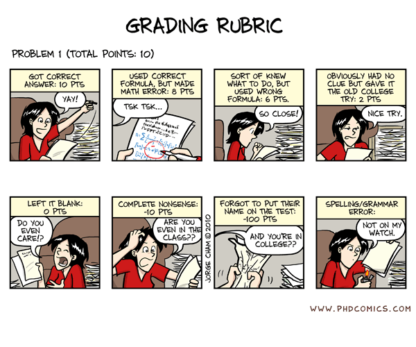
  • I hate grading. It’s boring, time-consuming, carries a lot of responsibility and you have to ensure every point you deduct is justified, because you might have to defend your judgement in case a student complains. Sometimes it can also freak you out completely (“OMGWTF, how could they understand it so wrong?? Why didn’t they ask?”) These strips sum it up perfectly (and with a good dose of humor):

Grading Rubric

If only

Articles, Original, Personal, CSS, Education, JS, HTML, Web Standards, SVG, Teaching, XPath, XSLT
Edit post on GitHub

Tip: Multi-step form handling

3 min read 0 comments Report broken page

First of all, sorry for my long absence! I haven’t abandoned this blog, I was just really, really busy. I’m still busy, and this probably won’t change soon. However, I will still blog when I get too fed up with work or studying (this is one of these moments
). Now, let’s get to the meat.

The situation

In most web applications, even the simplest ones, the need for form handling will arise. There will be forms that need to be submitted, checked, processed or returned to the user informing them about any errors. A good empirical rule I try to follow is “Try not to produce URLs that don’t have a meaning if accessed directly”. It sounds simple and common-sense, doesn’t it? However, as Francois Voltaire said, “common sense is not so common”. I’ve seen variations of the following scenario several times, in several websites or even commercial web application software:

Lets assume we have a two step process, like a registration form with an arguablyÂč bad usability. The hypothetical script is called register.php (PHP is just an example here, the exact language doesn’t matter, it could be register.jsp or anything else). The user fills in the information required for the first step, and if they get it right, they advance to something like register.php?step=2 to complete the rest of the information. They fill in their information there as well, and submit the form. Everything is fine.

Or is it?

What we have done this way is that we have effectively created a completely useless URL. If someone tries to access register.php?step=2 directly (via their history for instance), we don’t have the POST data from the first step, so we either have to redirect them to the first step or, even worse, assume they are actually coming from the first step and present it to them full of errors telling them they got everything wrong. In both cases we have duplicate content, and in the second one, usability suffers a great deal.

So, the right way is to pass step=2 via POST as well. This way, the URL stays as it was (register.php) and we avoid all the problems mentioned above. So, we end up doing something like this:

... form fields here ...
<input type="hidden" name="step" value="2" />
<input type="submit" value="Create my account" />

Now we’re done. Or not?

This works fine. However, there’s still room for improvement. We could get rid of the extra input element by utilizing the submit button. Yeah, it’s a form element too, even though we often overlook that and just focus on styling it. If we give it a name, it will get sent along with the other form fields. So instead of the html above, we can do that:

... form fields here ...
<input type="submit" name="step" value="2" />

But wait! What the f*ck is that ???

Now usability suffers! Instead of our nice “Create my account” button, the user now sees a cryptic “2”. Who cares if it works or if it requires less code, if nobody understands how to register, right? Luckily for us, we don’t have to use the <input /> tag to create submit buttons. A better (in terms of styling, semantics, markup clarity etc), albeit less known, alternative exists: The <button /> tag. When using the <button /> tag, the label of the button is derived from the markup within the start and end tags (yeah, we can also have html elements in there, not only text nodes, in case you’re wondering), not from the value attribute. So, we can set it’s name and value attributes to whatever we want, and the user won’t notice a thing:

... form fields here ...
<button type="submit" name="step" value="2">Create my account</button>

It’s really simple, although not done often. I guess it’s one of these “OMG how come I’ve never thought about this??” kind of things. :P

Âč I firmly believe we should eliminate the number of steps required in any procedure and especially in registration forms that users are bored to fill in anyway. However, there’s an exception to that: If the form has to be big for some reason, breaking it into steps actually makes it more usable, since the user is not overwhelmed with all these fields. Another situation when this approach is favorable is when the second step is determined according to the data from the first, although thanks to JavaScript and Ajax, this is becoming obsolete nowadays.


On native, single-input, multiple file uploads

2 min read 0 comments Report broken page

If you are following the current news on web development, you probably heard that the new Safari 4 has a great feature: It natively allows the user to select multiple files via a single input control, if you specify a value for the attribute multiple:

<input type="file" multiple>

or, in XHTML:

<input type="file" multiple="multiple" />

You might not know that Opera supported multiple file uploads for a while now, based on the earlier Web Forms 2.0 standard in a slightly different (and more flexible) format:

<input type="file" min="1" max="9999″ />

Can we use those currently?

Sure we can, but we should provide fallbacks for the other browsers. Using these features will put pressure on the other browser vendors to implement them as well and generally, native is always better.

How can we find out whether the browser supports them?

Opera

Opera supports accessing those min and max properties as properties of the element. So, it’s quite trivial to check whether Opera-style multiple inputs are supported:

var supportsMin = (function(){
	var fi = document.createElement('input');
	fi.type = 'file';
	return fi.min === '' && fi.max === '';
})();

Safari 4

In Safari 4 the check would be equally simple, if it supported accessing the multiple attribute as a property. Then we could easily check whether it’s boolean and conclude that Safari-style multiple inputs are supported:

var supportsMultiple = (function(){
	var fi = document.createElement('input');
	fi.type = 'file';
	// The second check is probably redundant but what if in the future an implementor
	// decides to make the file inputs to handle multiple selections by default?
	// Yeah, it's not likely, but it's not entirely impossible.
	return fi.multiple === false || fi.multiple === true;
})();

However, that’s currently not the case. The good news are that I reported this as a bug today, and the Webkit team fixed it, so it will be possible in the next Webkit nightly!

Combining the two

You can easily combine these two together with the workaround you prefer:

// Create a file input that allows multiple file selection
var fi = document.createElement('input');
fi.type = 'file';

if(fi.multiple === false || fi.multiple === true) { fi.multiple = true; } else if(fi.min === ‘’ && fi.max === ‘’) { fi.min = 1; fi.max = 9999; } else { // Our preferred workaround here }

What about Mozilla?

Ok, we all know that IE will probably take years to implement similar functionality. But usually, the Mozilla team implements new and exciting stuff quite fast.

As it turns out, there is a relevant ticket sitting in their Bugzilla for a while now. If you want them to implement it, vote for it so that it’s priority increases.

If they do implement it in the way suggested, the code posted above will work for that too, without any changes - The advantages of feature detection baby! ;)

Articles, News, Browsers, Feature Detection, HTML, JS, WebKit, WebKit Bugs
Edit post on GitHub