8 posts on CSS Variables

Inline conditionals in CSS, now?

20 min read 0 comments Report broken page

The CSS WG resolved to add if() to CSS, but that won’t be in browsers for a while. What are our options in the meantime?

A couple days ago, I posted about the recent CSS WG resolution to add an if() function to CSS. Great as it may be, this is still a long way off, two years if everything goes super smoothly, more if not. So what can you do when you need conditionals right now?

You may be pleased to find that you’re not completely out of luck. There is a series of brilliant, horrible hacks that enable you to expose the kinds of higher level custom properties that conditionals typically enable.

Using hacks in production?!

The instinctive reaction many developers have when seeing hacks like these is “Nice hack, but can’t possibly ever use this in production”. This sounds reasonable on the surface (keeping the codebase maintainable is a worthy goal!) but when examined deeply, it reflects the wrong order of priorities, prioritizing developer convenience over user convenience.

The TAG maintains a Web Platform Design Principles document [1] that everyone designing APIs for the web platform is supposed to read and follow. I’m a strong believer in having published Design Principles, for any product[2]. They help stay on track, and remember what the big picture vision is, which is otherwise easy to lose sight of in the day to day minutiae. One of the core principles in the document is the Priority of Constituencies. The core of it is:

User needs come before the needs of web page authors, which come before the needs of user agent implementors, which come before the needs of specification writers, which come before theoretical purity.

Obviously in most projects there are far fewer stakeholders than for the whole web platform, but the spirit of the principle still applies: the higher the abstraction, the higher priority the user needs. Or, in other words, consumers above producers.

For a more relatable example, in a web app using a framework like e.g. Vue and several Vue components, the user needs of website users come before the needs of the web app developers, which come before the needs of the developers of its Vue components, which come before the needs of the Vue framework developers (sorry Evan :).

The TAG did not invent this principle; it is well known in UX and Product circles with a number of different wordings:

  • “Put the pain on those who can bear it”
  • Prefer internal complexity over external complexity

Why is that? Several reasons:

  • It is far easier to change the implementation than to change the user-facing API, so it’s worth making sacrifices to keep it clean from the get go.
  • Most products have way more users than developers, so this minimizes collective pain.
  • Internal complexity can be managed far more easily, with tooling or even good comments.
  • Managing complexity internally localizes it and contains it better.
  • Once the underlying platform improves, only one codebase needs to be changed to reap the benefits.

The corollary is that if hacks allow you to expose a nicer API to component users, it may be worth the increase in internal complexity (to a degree). Just make sure that part of the code is well commented, and keep track of it so you can return to it once the platform has evolved to not require a hack anymore.

Like all principles, this isn’t absolute. A small gain in user convenience is not a good tradeoff when it requires tremendous implementation complexity. But it’s a good north star to follow.

As to whether custom properties are a better option to control styling than e.g. attributes, I listed several arguments for that in my previous article. Although, there are also cases where using custom properties is not a good idea…

When is it not a good idea to do this?

In a nutshell, when the abstraction is likely to leak. Ugliness is only acceptable if it’s encapsulated and not exposed to component users. If there is a high chance they may come into contact with it, it might be a better idea to simply use attributes and call it a day.

A series of callouts with --variant declarations next to them

Example callouts with three variants.

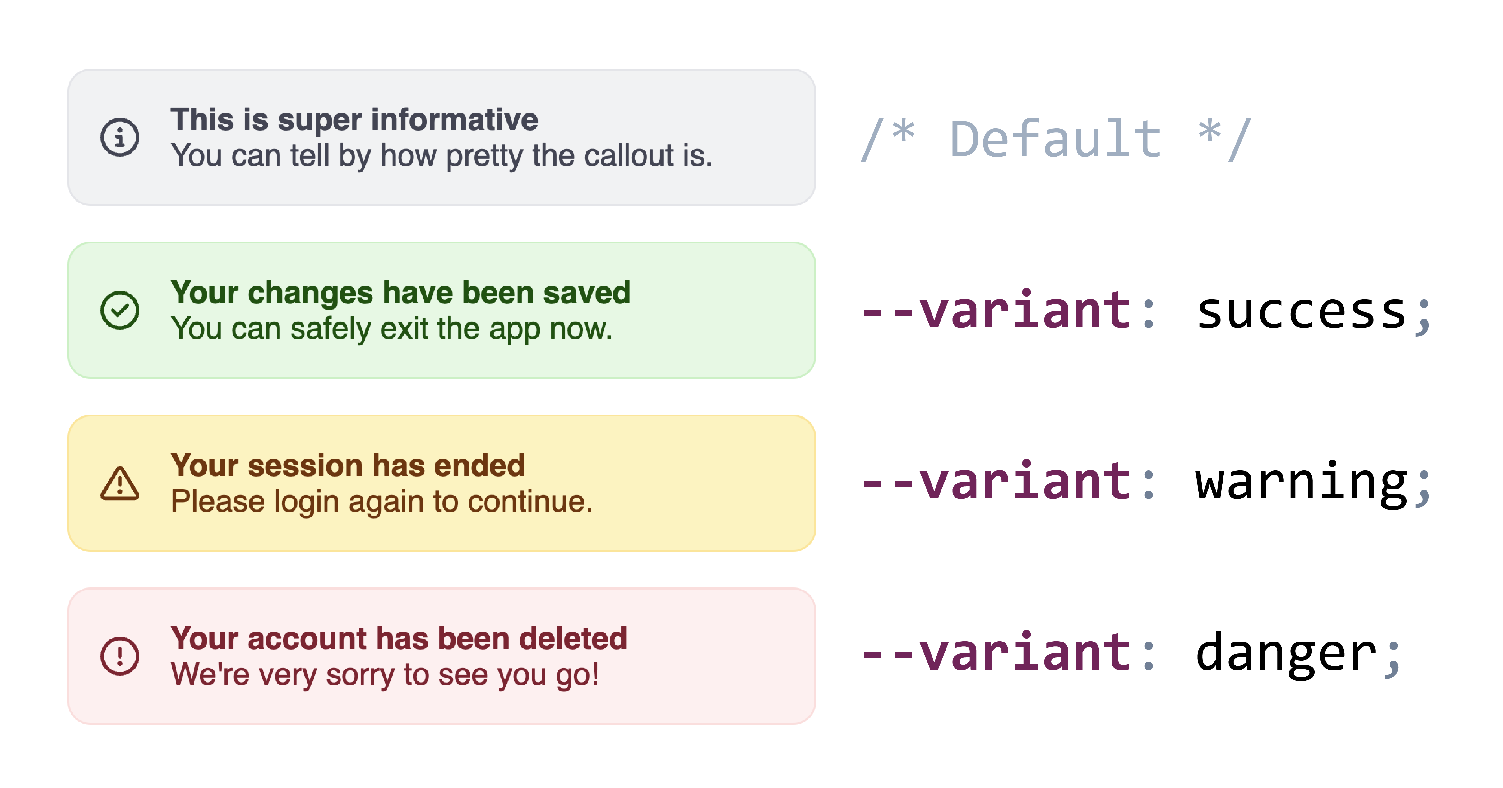
In many of the examples below, I use variants as the canonical example of a custom property that a component may want to expose. However, if component consumers may need to customize each variant, it may be better to use attributes so they can just use e.g. [variant="success"] instead of having to understand whatever crazy hack was used to expose a --variant custom property. And even from a philosophical purity perspective, variants are on the brink of presentational vs semantic anyway.

The current state of the art

There is a host of hacks and workarounds that people have come up with to make up for the lack of inline conditionals in CSS, with the first ones dating back to as early as 2015.

1. Binary Linear Interpolation

This was first documented by Roma Komarov in 2016, and has since been used in a number of creative ways. The gist of this method is to use essentially the linear interpolation formula for mapping [0,1] to [a,b]:

p×a+(1−p)×b

However, instead of using this to map a range to another range, we use it to map two points to two other points, basically the two extremes of both ranges: p=0 and p=1 to select a and b respectively.

This was Roma’s original example:

:root {
		--is-big: 0;
}

.is-big { –is-big: 1; }

.block { padding: calc( 25px * var(–is-big) + 10px * (1 - var(–is-big)) ); border-width: calc( 3px * var(–is-big) + 1px * (1 - var(–is-big)) ); }

He even expands it to multiple conditions by multiplying the interpolation factors. E.g. this code snippet to map 0 to 100px, 1 to 20px, and 2 to 3px:

.block {
		padding: calc(
				100px * (1 - var(--foo)) * (2 - var(--foo)) * 0.5 +
				20px  * var(--foo) * (2 - var(--foo)) +
				3px   * var(--foo) * (1 - var(--foo)) * -0.5
		);
}

Which these days could be rewritten as this, which also makes the boolean logic at play clearer:

.block {
		--if-not-0: min(max(0 - var(--foo), var(--foo) - 0), 1);
		--if-not-1: min(max(1 - var(--foo), var(--foo) - 1), 1);
		--if-not-2: min(max(2 - var(--foo), var(--foo) - 2), 1);

–if-0: var(–if-not-1) * var(–if-not-2); –if-1: var(–if-not-0) * var(–if-not-2); –if-2: var(–if-not-0) * var(–if-not-1);

padding: calc( 100px * var(–if-0) + 20px * var(–if-1) + 3px * var(–if-2) ); }

Back then, min() and max() were not available, so he had to divide each factor by an obscure constant to make it equal to 1 when it was not 0. Once abs() ships this will be even simpler (the inner max() is basically getting the absolute value of N - var(--foo))

Ana Tudor also wrote about this in 2018, in this very visual article: DRY Switching with CSS Variables. Pretty sure she was also using boolean algebra on these too (multiplication = AND, addition = OR), but I couldn’t find the exact post.

2. Toggles (Space Toggle, Cyclic Toggles)

This was independently discovered by Ana Tudor (c. 2017), Jane Ori in April 2020 (who gave it the name “Space Toggle”), David Khoursid (aka David K Piano) in June 2020 (he called it prop-and-lock), and yours truly in Oct 2020 (I called it the --var: ; hack, arguably the worst name of the three 😅).

The core idea is that var(--foo, fallback) is actually a very limited form of conditional: if --foo is initial (or IACVT), it falls back to fallback, otherwise it’s var(--foo). Furthermore, we can set custom properties (or their fallbacks) to empty values to get them to be ignored when used as part of a property value. It looks like this:

:root {
	--if-success: ;
	--if-warning: ;
}
.success {
	--if-success: initial;
}

.warning { –if-warning: initial; }

.callout { background: var(–if-success, var(–color-success-90)) var(–if-warning, var(–color-warning-90)); }

One of the downsides of this version is that it only supports two states per variable. Note how we needed two variables for the two states. Another downside is that there is no way to specify a fallback if none of the relevant variables are set. In the example above, if neither --if-success nor --if-warning are set, the background declaration will be empty, and thus become IACVT which will make it transparent.

Cyclic Toggles

In 2023, Roma Komarov expanded the technique into what he called “Cyclic Dependency Space Toggles” which addresses both limitations: it supports any number of states, and allows for a default value. The core idea is that variables do not only become initial when they are not set, or are explicitly set to initial, but also when cycles are encountered.

Roma’s technique depends on this behavior by producing cycles on all but one of the variables used for the values. It looks like this:

.info {
	--variant: var(--variant-default);

–variant-default: var(–variant,); –variant-success: var(–variant,); –variant-warning: var(–variant,); –variant-error: var(–variant,);

background: var(–variant-default, lavender) var(–variant-success, palegreen) var(–variant-warning, khaki) var(–variant-error, lightpink); }

And is used like this:

.my-warning {
	--variant: var(--variant-warning);
}

A downside of this method is that since the values behind the --variant-success, --variant-warning, etc variables are specific to the --variant variable they need to be namespaced to avoid clashes.

Layered Toggles

A big downside of most of these methods (except for the animation-based ones) is that you need to specify all values of the property in one place, and the declaration gets applied whether your custom property has a value or not, which makes it difficult to layer composable styles leading to some undesirable couplings.

Roma Komarov’s “Layered Toggles” method addresses this for some cases by allowing us to decouple the different values by taking advantage of Cascade Layers. The core idea is that Cascade Layers include a revert-layer keyword that will cause the current layer to be ignored wrt the declaration it’s used on. Given that we can use unnamed layers, we can simply user a @layer {} rule for every block of properties we want to apply conditionally.

This approach does have some severe limitations which made it rather unpractical for my use cases. The biggest one is that anything in a layer has lower priority than any unlayered styles, which makes it prohibitive for many use cases. Also, this doesn’t really simplify cyclic toggles, you still need to set all values in one place. Still, worth a look as there are some use cases it can be helpful for.

3. Paused animations

The core idea behind this method is that paused animations (animation-play-state: paused) can still be advanced by setting animation-delay to a negative value. For example in an animation like animation: 100s foo, you can access the 50% mark by setting animation-delay: -50s. It’s trivial to transform raw numbers to <time> values, so this can be abstracted to plain numbers for the user-facing API.

Here is a simple example to illustrate how this works:

@keyframes color-mixin {
	0% { background: var(--color-neutral-90); border-color: var(--color-neutral-80); }
	25% { background: var(--color-success-90); border-color: var(--color-success-80); }
	50% { background: var(--color-warning-90); border-color: var(--color-warning-80); }
	75% { background: var(--color-danger-90); border-color: var(--color-danger-80); }
}

button { animation: foo 100s calc(var(–variant) * -100s / 4 ) infinite paused; }

Used like:

.error button {
	--variant: 2;
}

This is merely to illustrate the core idea, having a --variant property that takes numbers is not a good API! Though the numbers could be aliased to variables, so that users would set --variant: var(--success).

This technique seems to have been first documented by me in 2015, during a talk about …pie charts (I would swear I showed it in an earlier talk but I cannot find it). I never bothered writing about it, but someone else did, 4 years later.

To ensure you don’t get slightly interpolated values due to precision issues, you could also slap a steps() in there:

button {
	animation: foo 100s calc(var(--variant) * -100s / 4 ) infinite paused steps(4);
}

This is especially useful when 100 divided by your number of values produces repeating decimals, e.g. 3 steps means your keyframes are at increments of 33.33333%.

A benefit of this method is that defining each state is done with regular declarations, not involving any weirdness, and that .

It does also have some obvious downsides:

  • Values restricted to numbers
  • Takes over the animation property, so you can’t use it for actual animations.

4. Type Grinding

So far all of these methods impose constraints on the API exposed by these custom properties: numbers by the linear interpolation method and weird values that have to be hidden behind variables for the space toggle and cyclic toggle methods.

In October 2022, Jane Ori was the first one to discover a method that actually allows us to support plain keywords, which is what the majority of these use cases needs. She called it “CSS-Only Type Grinding”.

Its core idea is if a custom property is registered (via either @property or CSS.registerProperty()), assigning values to it that are not valid for its syntax makes it IACVT (Invalid at computed value time) and it falls back to its initial (or inherited) value.

She takes advantage of that to progressively transform keywords to other keywords or numbers through a series of intermediate registered custom properties, each substituting one more value for another.

I was recently independently experimenting with a similar idea. It started from a use case of one of my components where I wanted to implement a --size property with two values: normal and large. Style queries could almost get me there, but I also needed to set flex-flow: column on the element itself when --size was large.

The end result takes N + 1 @property rules, where N is the number of distinct values you need to support. The first one is the rule defining the syntax of your actual property:

@property --size {
	syntax: "normal | large",
	initial-value: normal;
	inherits: true;
}

Then, you define N more rules, each progressively substituting one value for another:

@property --size-step-1 {
	syntax: "row | large";
	initial-value: row;
	inherits: false;
}

@property --size-step-end { syntax: "row | column"; initial-value: column; inherits: false; }

And at the component host you daisy chain them like this:

:host {
	--size-step-1: var(--size);
	--size-step-end: var(--size-step-1);
	flex-flow: var(--size-step-end);
}

And component consumers get a really nice API:

.my-component {
	--size: large;
}

You can see it in action in this codepen:

See the Pen Transform keywords to other keywords (2 keyword version) by Lea Verou (@leaverou) on CodePen.

You can use the same general idea to transform more keywords or to transform keywords into different sets of keywords for use in different properties.

We can also transform keywords to numbers, by replacing successive keywords with <integer> in the syntax, one at a time, with different initial values each time. Here is the --variant example using this method:

@property --variant {
	syntax: "none | success | warning | danger";
	initial-value: none;
	inherits: true;
}

@property --variant-step-1 { syntax: "none | <integer> | warning | danger"; initial-value: 1; inherits: false; }

@property --variant-step-2 { syntax: "none | <integer> | danger"; initial-value: 2; inherits: false; }

@property --variant-step-3 { syntax: "none | <integer>"; initial-value: 3; inherits: false; }

@property --variant-index { syntax: "<integer>"; initial-value: 0; inherits: false; }

.callout { –variant-step-1: var(–variant); –variant-step-2: var(–variant-step-1); –variant-step-3: var(–variant-step-2); –variant-index: var(–variant-step-3);

/* Now use --variant-index to set other values */ }

Then, we can use techniques like linear range mapping to transform it to a length or a percentage (generator) or recursive color-mix() to use that number to select an appropriate color.

5. Variable animation name

In 2018, Roma Komarov discovered another method that allows plain keywords to be used as the custom property API, forgot about it, then rediscovered it in June 2023 😅. He still never wrote about it, so these codepens are the only documentation we have. It’s a variation of the previous method: instead of using a single @keyframes rule and switching between them via animation-delay, define several separate @keyframes rules, each named after the keyword we want to use:

@keyframes success {
	from, to {
		background-color: var(--color-success-90);
		border-color: var(--color-success-80);
	}
}
@keyframes warning {
	from, to {
		background-color: var(--color-warning-90);
		border-color: var(--color-warning-80);
	}
}
@keyframes danger {
	from, to {
		background-color: var(--color-danger-90);
		border-color: var(--color-danger-80);
	}
}

.callout { padding: 1em; margin: 1rem; border: 3px solid var(–color-neutral-80); background: var(–color-neutral-90);

animation: var(–variant) 0s paused both; }

Used like:

.warning {
	--variant: warning;
}

The obvious downsides of this method are:

  • Impractical to use outside of Shadow DOM due to the potential for name clashes.
  • Takes over the animation property, so you can’t use it for actual animations.

Improvements

Every one of these methods has limitations, some of which are inerent in its nature, but others can be improved upon. In this section I will discuss some improvements that me or others have thought of. I decided to include these in a separate section, since they affect more than one method.

Making animation-based approaches cascade better

A big downside with the animation-based approaches (3 and 5) is the place of animations in the cascade: properties applied via animation keyframes can only be overridden via other animations or !important.

One way to deal with that is to set custom properties in the animation keyframes, that you apply in regular rules. To use the example from Variable animation name:

@keyframes success {
	from, to {
		--background-color: var(--color-success-90);
		--border-color: var(--color-success-80);
	}
}
@keyframes warning {
	from, to {
		--background-color: var(--color-warning-90);
		--border-color: var(--color-warning-80);
	}
}
@keyframes danger {
	from, to {
		--background-color: var(--color-danger-90);
		--border-color: var(--color-danger-80);
	}
}

.callout { padding: 1em; margin: 1rem; border: 3px solid var(–border-color, var(–color-neutral-80)); background-color: var(–background-color, var(–color-neutral-90));

animation: var(–variant) 0s paused both; }

Note that you can combine the two approaches (variable animation-name and paused animations) when you have two custom properties where each state of the first corresponds to N distinct states of the latter. For example, a --variant that sets colors, and a light/dark mode within each variant that sets different colors.

Making animation-based approaches compose better with author code

Another downside of the animation-based approaches is that they take over the animation property. If authors want to apply an animation to your component, suddenly a bunch of unrelated things stop working, which is not great user experience.

There isn’t that much to do here to prevent this experience, but you can at least offer a way out: instead of defining your animations directly on animation, define them on a custom property, e.g. --core-animations. Then, if authors want to apply their own animations, they just make sure to also include var(--core-animations) before or after.

Discrete color scales

Many of the approaches above are based on numerical values, which are then mapped to the value we actually want. For numbers or dimensions, this is easy. But what about colors?

I linked to Noah Liebman’s post above on recursive color-mix(), where he presents a rather complex method to select among a continuous color scale based on a 0-1 number.

However, if you don’t care about any intermediate colors and just want to select among a few discrete colors, the method can be a lot simpler. Simple enough to be specified inline.

Let me explain: Since color-mix() only takes two colors, we need to nest them to select among more than 2, no way around that. However, the percentages we calculate can be very simple: 100% when we want to select the first color and 0% otherwise. I plugged these numbers into my CSS range mapping tool (example) and noticed a pattern: If we want to output 100% when our variable (e.g. --variant-index) is N-1 and 0% when it’s N, we can use 100% * (N - var(--variant-index)).

We can use this on every step of the mixing:

background: color-mix(in oklab,
	var(--stone-2) calc(100% * (1 - var(--color-index, 0))), /* default color */
	color-mix(in oklab,
		var(--green-2) calc(100% * (2 - var(--color-index))),
		color-mix(in oklab,
			var(--yellow-2) calc(100% * (3 - var(--color-index))),
			var(--red-2)
		)
	)
);

But what happens when the resulting percentage is < 0% or > 100%? Generally, percentages outside [0%, 100%] make color-mix() invalid, which would indicate that we need to take care to keep our percentages within that range (via clamp() or max()). However, within math functions there is no parse-time range-checking, so values are simply clamped to the allowed range.

Here is a simple example that you can play with (codepen):

See the Pen Discrete color scales with simpler recursive color-mix() by Lea Verou (@leaverou) on CodePen.

And here is a more realistic one, using the Type Grinding method to transform keywords to numbers, and then using the above technique to select among 4 colors for backgrounds and borders (codepen).

Combining approaches

There are two components to each method: the input values it supports, i.e. your custom property API that you will expose, e.g. numbers, keywords, etc., and the output values it supports (<dimension>, keywords, etc.).

Even without doing anything, we can combine methods that support the same type of input values, e.g. Binary Linear Interpolation and Paused animations or Type Grinding and Variable animation names.

If we can transform the input values of one method to the input values of another, we can mix and match approaches to maximize flexibility. For example, we can use type grinding to transform keywords to numbers, and then use paused animations or binary linear interpolation to select among a number of quantitative values based on that number.

Keywords → Numbers
Type grinding
Numbers → Keywords
We can use paused animations to select among a number of keywords based on a number (which we transform to a negative animation-delay).
Space toggles → Numbers
Easy: --number: calc(0 var(--toggle, + 1))
Numbers → Space toggles
Once again, Roma Komarov has come up with a very cool trick: he conditionally applies an animation which interpolates two custom properties from initial to the empty value and vice versa — basically variable animation names but used on an internal value. Unfortunately a Firefox bug prevents it from working interoperably. He also tried a variant for space toggles but that has even worse compatibility, limited to Chrome only. I modified his idea a bit to use paused animations instead, and it looks like my attempt works on Firefox as well. 🎉

So, which one is better?

I’ve summarized the pros and cons of each method below:

Method Input values Output values Pros Cons

Binary Linear Interpolation

Numbers Quantitative
  • Lightweight
  • Requires no global rules
  • Limited output range

Toggles

var(--alias) (actual values are too weird to expose raw)

Any
  • Can be used in part of a value
  • Weird values that need to be aliased

Paused animations

Numbers Any
  • Normal, decoupled declarations
  • Takes over animation property
  • Cascade weirdness

Type Grinding

Keywords

Any value supported by the syntax descriptor

  • High flexibility for exposed API
  • Good encapsulation
  • Must insert CSS into light DOM
  • Tedious code (though can be automated with build tools)
  • No Firefox support (though that’s changing)

Variable animation name

Keywords Any
  • Normal, decoupled declarations
  • Impractical outside of Shadow DOM due to name clashes
  • Takes over animation property
  • Cascade weirdness

The most important consideration is the API we want to expose to component users. After all, exposing a nicer API is the whole point of this, right?

If your custom property makes sense as a number without degrading usability (e.g. --size may make sense as a number, but small | medium | large is still better than 0 | 1 | 2), then Binary Linear Interpolation is probably the most flexible method to start with, and as we have seen in Combining approaches section, numbers can be converted to inputs for every other method.

However, in the vast majority of cases I have seen, the north star API is a set of plain, high-level keywords. This is only possible via Type Grinding and Variable animation names.

Between the two, Type Grinding is the one providing the best encapsulation, since it relies entirely on custom properties and does not hijack any native properties.

Unfortunately, the fact that @property is not yet supported in Shadow DOM throws a spanner in the works, but since these intermediate properties are only used for internal calculations, we can just give them obscure names and insert them in the light DOM.

On the other hand, @keyframes are not only allowed, but also properly scoped when used in Shadow DOM, so Variable animation name might be a good choice when you don’t want to use the same keywords for multiple custom properties on the same component and its downsides are not dealbreakers for your particular use case.

Conclusion

Phew! That was a long one. If you’re aware of any other techniques, let me know so I can add them.

And I think after all of this, if you had any doubt that we need if() in CSS, the sheer number and horribleness of these hacks must have dispelled it by now. 😅

Thanks to Roma Komarov for reviewing earlier drafts of this article.


  1. I’ve always thought this was our most important deliverable, and pushed for prioritizing it. Recently, I even became editor of it. 🙃 ↩︎

  2. I’m using product here in the general sense, of any software product, technology, or API, not just for-profit or commercial ones. ↩︎


Inline conditionals in CSS?

6 min read 0 comments Report broken page

Last week, the CSS WG resolved to add an inline if() to CSS. But what does that mean, and why is it exciting?

Last week, we had a CSS WG face-to-face meeting in A Coruña, Spain. There is one resolution from that meeting that I’m particularly excited about: the consensus to add an inline if() to CSS. While I was not the first to propose an inline conditional syntax, I did try and scope down the various nonterminating discussions into an MVP that can actually be implemented quickly, discussed ideas with implemenators, and eventually published a concrete proposal and pushed for group resolution. Quite poetically, the relevant discussion occurred on my birthday, so in a way, I got if() as the most unique birthday present ever. 😀

This also comes to show that proposals being rejected is not the end-all for a given feature. It is in fact quite common for features to be rejected for several times before they are accepted: CSS Nesting, :has(), container queries were all simply the last iteration in a series of rejected proposals. if() itself was apparently rejected in 2018 with very similar syntax to what I proposed. What was the difference? Style queries had already shipped, and we could simply reference the same syntax for conditions (plus media() and supports() from Tab’s @when proposal) whereas in the 2018 proposal how conditions would work was largely undefined.

I posted about this on a variety of social media, and the response by developers has been overwhelmingly positive:

I even had friends from big companies writing to tell me their internal Slacks blew up about it. This proves what I’ve always suspected, and was part of the case I made to the CSS WG: that this is a huge pain point. Hopefully the amount and intensity of positive reactions will help browsers prioritize this feature and add it to their roadmaps earlier rather than later.

Across all these platforms, besides the “I can’t wait for this to ship!” sentiment being most common, there were a few other recurring questions and a fair bit of confusion that I figured were worth addressing.

Continue reading


Custom properties with defaults: 3+1 strategies

4 min read 0 comments Report broken page

When developing customizable components, one often wants to expose various parameters of the styling as custom properties, and form a sort of CSS API. This is still underutlized, but there are libraries, e.g. Shoelace, that already list custom properties alongside other parts of each component’s API (even CSS parts!).

Note: I’m using “component” here broadly, as any reusable chunk of HTML/CSS/JS, not necessarily a web component or framework component. What we are going to discuss applies to reusable chunks of HTML just as much as it does to “proper” web components.

Let’s suppose we are designing a certain button styling, that looks like this:

We want to support a --color custom property for creating color variations by setting multiple things internally:

.fancy-button {
	border: .1em solid var(--color);
	background: transparent;
	color: var(--color);
}

.fancy-button:hover {
	background: var(--color);
	color: white;
}

Note that with the code above, if no --color is set, the three declarations using it will be IACVT and thus we’ll get a nearly unstyled text-only button with no background on hover (transparent), no border on hover, and the default black text color (canvastext to be precise).

That’s no good! IT’s important that we set defaults. However, using the fallback parameter for this gets tedious, and WET:

Continue reading

Articles, Original, Tutorials, CSS, CSS Custom Properties, CSS Variables, Dynamic CSS
Edit post on GitHub

Dark mode in 5 minutes, with inverted lightness variables

6 min read 0 comments Report broken page

By now, you probably know that you can use custom properties for individual color components, to avoid repeating the same color coordinates multiple times throughout your theme. You may even know that you can use the same variable for multiple components, e.g. HSL hue and lightness:

:root {
	--primary-hs: 250 30%;
}

h1 {
	color: hsl(var(--primary-hs) 30%);
}

article {
	background: hsl(var(--primary-hs) 90%);
}

article h2 {
	background: hsl(var(--primary-hs) 40%);
	color: white;
}

Here is a very simple page designed with this technque:

Unlike preprocessor variables, you could even locally override the variable, to have blocks with a different accent color:

:root {
	--primary-hs: 250 30%;
	--secondary-hs: 190 40%;
}

article {
	background: hsl(var(--primary-hs) 90%);
}

article.alt {
	--primary-hs: var(--secondary-hs);
}

This is all fine and dandy, until dark mode comes into play. The idea of using custom properties to make it easier to adapt a theme to dark mode is not new. However, in every article I have seen, the strategy suggested is to create a bunch of custom properties, one for each color, and override them in a media query.

This is a fine approach, and you’ll likely want to do that for at least part of your colors eventually. However, even in the most disciplined of designs, not every color is a CSS variable. You often have colors declared inline, especially grays (e.g. the footer color in our example). This means that adding a dark mode is taxing enough that you may put it off for later, especially on side projects.

The trick I’m going to show you will make anyone who knows enough about color cringe (sorry Chris!) but it does help you create a dark mode that works in minutes. It won’t be great, and you should eventually tweak it to create a proper dark mode (also dark mode is not just about swapping colors) but it’s better than nothing and can serve as a base.

Continue reading


The -​-var: ; hack to toggle multiple values with one custom property

2 min read 0 comments Report broken page

What if I told you you could use a single property value to turn multiple different values on and off across multiple different properties and even across multiple CSS rules?

What if I told you you could turn this flat button into a glossy skeuomorphic button by just tweaking one custom property --is-raised, and that would set its border, background image, box and text shadows in one fell swoop?

How, you may ask?

The crux of this technique is this: There are two custom property values that work almost everywhere there is a var() call with a fallback.

The more obvious one that you probably already know is the initial value, which makes the property just apply its fallback. So, in the following code:

background: var(--foo, linear-gradient(white, transparent)) hsl(220 10% 50%);
border: 1px solid var(--foo, rgb(0 0 0 / .1));
color: rgb(0 0 0 var(--foo, / .8));

We can set --foo to initial to enable these “fallbacks” and append these values to the property value, adding a gradient, setting a border-color, and making the text color translucent in one go. But what to do when we want to turn these values off? Any non-initial value for --foo (that doesn’t create cycles) should work. But is there one that works in all three declarations?

It turns out there is another value that works everywhere, in every property a var() reference is present, and you’d likely never guess what it is (unless you have watched any of my CSS variable talks and have a good memory for passing mentions of things).

Intrigued?

It’s whitespace! Whitespace is significant in a custom property. When you write something like this:

--foo: ;

This is not an invalid declaration. This is a declaration where the value of --foo is literally one space character. However, whitespace is valid in every CSS property value, everywhere a var() is allowed, and does not affect its computed value in any way. So, we can just set our property to one space (or even a comment) and not affect any other value present in the declaration. E.g. this:

--foo: ;
background: var(--foo, linear-gradient(white, transparent)) hsl(220 10% 50%);

produces the same result as:

background: hsl(220 10% 50%);

We can take advantage of this to essentially turn var() into a single-clause if() function and conditionally append values based on a single custom property.

As a proof of concept, here is the two button demo refactored using this approach:

Limitations

I originally envisioned this as a building block for a technique horrible hack to enable “mixins” in the browser, since @apply is now defunct. However, the big limitation is that this only works for appending values to existing values — or setting a property to either a whole value or initial. There is no way to say “the background should be red if --foo is set and white otherwise”. Some such conditionals can be emulated with clever use of appending, but not most.

And of course there’s a certain readability issue: --foo: ; looks like a mistake and --foo: initial looks pretty weird, unless you’re aware of this technique. However, that can easily be solved with comments. Or even constants:

:root {
	--ON: initial;
	--OFF: ;
}

button { –is-raised: var(–OFF); /* … */ }

#foo { –is-raised: var(–ON); }

Also do note that eventually we will get a proper if() and won’t need such horrible hacks to emulate it, discussions are already underway [w3c/csswg-drafts#5009 w3c/csswg-drafts#4731].

So what do you think? Horrible hack, useful technique, or both? 😀

Prior art

Turns out this was independently discovered by two people before me:

And it was called “space toggle hack” in case you want to google it!


The Cicada Principle, revisited with CSS variables

4 min read 0 comments Report broken page

Many of today’s web crafters were not writing CSS at the time Alex Walker’s landmark article The Cicada Principle and Why it Matters to Web Designers was published in 2011. Last I heard of it was in 2016, when it was used in conjunction with blend modes to pseudo-randomize backgrounds even further.

So what is the Cicada Principle and how does it relate to web design in a nutshell? It boils down to: when using repeating elements (tiled backgrounds, different effects on multiple elements etc), using prime numbers for the size of the repeating unit maximizes the appearance of organic randomness. Note that this only works when the parameters you set are independent.

When I recently redesigned my blog, I ended up using a variation of the Cicada principle to pseudo-randomize the angles of code snippets. I didn’t think much of it until I saw this tweet:

This made me think: hey, maybe I should actually write a blog post about the technique. After all, the technique itself is useful for way more than angles on code snippets.

The main idea is simple: You write your main rule using CSS variables, and then use :nth-of-*() rules to set these variables to something different every N items. If you use enough variables, and choose your Ns for them to be prime numbers, you reach a good appearance of pseudo-randomness with relatively small Ns.

In the case of code samples, I only have two different top cuts (going up or going down) and two different bottom cuts (same), which produce 2*2 = 4 different shapes. Since I only had four shapes, I wanted to maximize the pseudo-randomness of their order. A first attempt looks like this:

pre {
	clip-path: polygon(var(--clip-top), var(--clip-bottom));
	--clip-top: 0 0, 100% 2em;
	--clip-bottom: 100% calc(100% - 1.5em), 0 100%;
}

pre:nth-of-type(odd) { –clip-top: 0 2em, 100% 0; }

pre:nth-of-type(3n + 1) { –clip-bottom: 100% 100%, 0 calc(100% - 1.5em); }

This way, the exact sequence of shapes repeats every 2 * 3 = 6 code snippets. Also, the alternative --clip-bottom doesn’t really get the same visibility as the others, being present only 33.333% of the time. However, if we just add one more selector:

pre {
	clip-path: polygon(var(--clip-top), var(--clip-bottom));
	--clip-top: 0 0, 100% 2em;
	--clip-bottom: 100% calc(100% - 1.5em), 0 100%;
}

pre:nth-of-type(odd) { –clip-top: 0 2em, 100% 0; }

pre:nth-of-type(3n + 1), pre:nth-of-type(5n + 1) { –clip-bottom: 100% 100%, 0 calc(100% - 1.5em); }

Now the exact same sequence of shapes repeats every 2 * 3 * 5 = 30 code snippets, probably way more than I will have in any article. And it’s more fair to the alternate --clip-bottom, which now gets 1/3 + 1/5 - 1/15 = 46.67%, which is almost as much as the alternate --clip-top gets!

You can explore this effect in this codepen:

https://codepen.io/leaverou/pen/8541bfd3a42551f8845d668f29596ef9?editors=1100

Or, to better explore how different CSS creates different pseudo-randomness, you can use this content-less version with three variations:

https://codepen.io/leaverou/pen/NWxaPVx

Of course, the illusion of randomness is much better with more shapes, e.g. if we introduce a third type of edge we get 3 * 3 = 9 possible shapes:

https://codepen.io/leaverou/pen/dyGmbJJ?editors=1100

I also used primes 7 and 11, so that the sequence repeats every 77 items. In general, the larger primes you use, the better the illusion of randomness, but you need to include more selectors, which can get tedious.

Other examples

So this got me thinking: What else would this technique be cool on? Especially if we include more values as well, we can pseudo-randomize the result itself better, and not just the order of only 4 different results.

So I did a few experiments.

Pseudo-randomized color swatches

https://codepen.io/leaverou/pen/NWxXQKX

Pseudo-randomized color swatches, with variables for hue, saturation, and lightness.

And an alternative version:

https://codepen.io/leaverou/pen/RwrLPer

Which one looks more random? Why do you think that is?

Pseudo-randomized border-radius

Admittedly, this one can be done with just longhands, but since I realized this after I had already made it, I figured eh, I may as well include it 🤷🏽‍♀️

https://codepen.io/leaverou/pen/ZEQXOrd

It is also really cool when combined with pseudo-random colors (just hue this time):

https://codepen.io/leaverou/pen/oNbGzeE

Pseudo-randomized snowfall

Lots of things here:

  • Using translate and transform together to animate them separately without resorting to CSS.registerPropery()
  • Pseudo-randomized horizontal offset, animation-delay, font-size
  • Technically we don’t need CSS variables to pseudo-randomize font-size, we can just set the property itself. However, variables enable us to pseudo-randomize it via a multiplier, in order to decouple the base font size from the pseudo-randomness, so we can edit them independently. And then we can use the same multiplier in animation-duration to make smaller snowflakes fall slower!

https://codepen.io/leaverou/pen/YzwrWvV?editors=1100

Conclusions

In general, the larger the primes you use, the better the illusion of randomness. With smaller primes, you will get more variation, but less appearance of randomness.

There are two main ways to use primes to create the illusion of randomness with :nth-child() selectors:

The first way is to set each trait on :nth-child(pn + b) where p is a prime that increases with each value and b is constant for each trait, like so:

:nth-child(3n + 1)  { property1: value11; }
:nth-child(5n + 1)  { property1: value12; }
:nth-child(7n + 1)  { property1: value13; }
:nth-child(11n + 1) { property1: value14; }
...
:nth-child(3n + 2)  { property2: value21; }
:nth-child(5n + 2)  { property2: value22; }
:nth-child(7n + 2)  { property2: value23; }
:nth-child(11n + 2) { property2: value24; }
...

The benefit of this approach is that you can have as few or as many values as you like. The drawback is that because primes are sparse, and become sparser as we go, you will have a lot of “holes” where your base value is applied.

The second way (which is more on par with the original Cicada principle) is to set each trait on :nth-child(pn + b) where p is constant per trait, and b increases with each value:

:nth-child(5n + 1) { property1: value11; }
:nth-child(5n + 2) { property1: value12; }
:nth-child(5n + 3) { property1: value13; }
:nth-child(5n + 4) { property1: value14; }
...
:nth-child(7n + 1) { property2: value21; }
:nth-child(7n + 2) { property2: value22; }
:nth-child(7n + 3) { property2: value23; }
:nth-child(7n + 4) { property2: value24; }
...

This creates a better overall impression of randomness (especially if you order the values in a pseudo-random way too) without “holes”, but is more tedious, as you need as many values as the prime you’re using.

What other cool examples can you think of?


Hybrid positioning with CSS variables and max()

4 min read 0 comments Report broken page

Notice how the navigation on the left behaves wrt scrolling: It’s like absolute at first that becomes fixed once the header scrolls out of the viewport.

One of my side projects these days is a color space agnostic color conversion & manipulation library, which I’m developing together with my husband, Chris Lilley (you can see a sneak peek of its docs above). He brings his color science expertise to the table, and I bring my JS & API design experience, so it’s a great match and I’m really excited about it! (if you’re serious about color and you’re building a tool or demo that would benefit from it contact me, we need as much early feedback on the API as we can get! )

For the documentation, I wanted to have the page navigation on the side (when there is enough space), right under the header when scrolled all the way to the top, but I wanted it to scroll with the page (as if it was absolutely positioned) until the header is out of view, and then stay at the top for the rest of the scrolling (as if it used fixed positioning).

It sounds very much like a case for position: sticky, doesn’t it? However, an element with position: sticky behaves like it’s relatively positioned when it’s in view and like it’s using position: fixed when its scrolled out of view but its container is still in view. What I wanted here was different. I basically wanted position: absolute while the header was in view and position: fixed after. Yes, there are ways I could have contorted position: sticky to do what I wanted, but was there another solution?

In the past, we’d just go straight to JS, slap position: absolute on our element, calculate the offset in a scroll event listener and set a top CSS property on our element. However, this is flimsy and violates separation of concerns, as we now need to modify Javascript to change styling. Pass!

What if instead we had access to the scroll offset in CSS? Would that be sufficient to solve our use case? Let’s find out!

As I pointed out in my Increment article about CSS Variables last month, and in my CSS Variables series of talks a few years ago, we can use JS to set & update CSS variables on the root that describe pure data (mouse position, input values, scroll offset etc), and then use them as-needed throughout our CSS, reaching near-perfect separation of concerns for many common cases. In this case, we write 3 lines of JS to set a --scrolltop variable:

let root = document.documentElement;
document.addEventListener("scroll", evt => {
	root.style.setProperty("--scrolltop", root.scrollTop);
});

Then, we can position our navigation absolutely, and subtract var(--scrolltop) to offset any scroll (11rem is our header height):

#toc {
	position: fixed;
	top: calc(11rem - var(--scrolltop) * 1px);
}

This works up to a certain point, but once scrolltop exceeds the height of the header, top becomes negative and our navigation starts drifting off screen:

Just subtracting --scrolltop essentially implements absolute positioning with position: fixed.

We’ve basically re-implemented absolute positioning with position: fixed, which is not very useful! What we really want is to cap the result of the calculation to 0 so that our navigation always remains visible. Wouldn’t it be great if there was a max-top attribute, just like max-width so that we could do this?

One thought might be to change the JS and use Math.max() to cap --scrolltop to a specific number that corresponds to our header height. However, while this would work for this particular case, it means that --scrolltop cannot be used generically anymore, because it’s tailored to our specific use case and does not correspond to the actual scroll offset. Also, this encodes more about styling in the JS than is ideal, since the clamping we need is presentation-related — if our style was different, we may not need it anymore. But how can we do this without resorting to JS?

Thankfully, we recently got implementations for probably the one feature I was pining for the most in CSS, for years: min(), max() and clamp() functions, which bring the power of min/max constraints to any CSS property! And even for width and height, they are strictly more powerful than min/max-* because you can have any number of minimums and maximums, whereas the min/max-* properties limit you to only one.

While brower compatibility is actually pretty good, we can’t just use it with no fallback, since this is one of the features where lack of support can be destructive. We will provide a fallback in our base style and use @supports to conditonally override it:

#toc {
	position: fixed;
	top: 11em;
}

@supports (top: max(1em, 1px)) { #toc { top: max(0em, 11rem - var(–scrolltop) * 1px); } }

Aaand that was it, this gives us the result we wanted!

And because --scrolltop is sufficiently generic, we can re-use it anywhere in our CSS where we need access to the scroll offset. I’ve actually used exactly the scame --scrolltop setting JS code in my blog, to keep the gradient centerpoint on my logo while maintaining a fixed background attachment, so that various elements can use the same background and having it appear continuous, i.e. not affected by their own background positioning area:

The website header and the post header are actually different element. The background appears continuous because it’s using background-attachment: fixed, and the scrolltop variable is used to emulate background-attachment: scroll while still using the viewport as the background positioning area for both backgrounds.

Appendix: Why didn’t we just use the cascade?

You might wonder, why do we even need @supports? Why not use the cascade, like we’ve always done to provide fallbacks for values without sufficiently universal support? I.e., why not just do this:

#toc {
	position: fixed;
	top: 11em;
	top: max(0em, 11rem - var(--scrolltop) * 1px);
}

The reason is that when you use CSS variables, this does not work as expected. The browser doesn’t know if your property value is valid until the variable is resolved, and by then it has already processed the cascade and has thrown away any potential fallbacks.

So, what would happen if we went this route and max() was not supported? Once the browser realizes that the second value is invalid due to using an unknown function, it will make the property invalid at computed value time, which essentially equates to the initial keyword, and for the top property, the initial value is 0. This would mean your navigation would overlap the header when scrolled close to the top, which is terrible!


Autoprefixing, with CSS variables!

1 min read 0 comments Report broken page

Recently, when I was making the minisite for markapp.io, I realized a neat trick one can do with CSS variables, precisely due to their dynamic nature. Let’s say you want to use a property that has multiple versions: an unprefixed one and one or more prefixed ones. In this example we are going to use clip-path, which currently needs both an unprefixed version and a -webkit- prefixed one, however the technique works for any property and any number of prefixes or different property names, as long as the value is the same across all variations of the property name.

The first part is to define a --clip-path property on every element with a value of initial. This prevents the property from being inherited every time it’s used, and since the * has zero specificity, any declaration that uses --clip-path can override it. Then you define all variations of the property name with var(--clip-path) as their value:

* {
	--clip-path: initial;
	-webkit-clip-path: var(--clip-path);
	clip-path: var(--clip-path);
}

Then, every time we need clip-path, we use --clip-path instead and it just works:

header {
	--clip-path: polygon(0% 0%, 100% 0%, 100% calc(100% - 2.5em), 0% 100%);
}

Even !important should work, because it affects the cascading of CSS variables. Furthermore, if for some reason you want to explicitly set -webkit-clip-path, you can do that too, again because * has zero specificity. The main downside to this is that it limits browser support to the intersection of the support for the feature you are using and support for CSS Variables. However, all browsers except Edge support CSS variables, and Edge is working on it. I can’t see any other downsides to it (except having to use a different property name obvs), but if you do, let me know in the comments!

I think there’s still a lot to be discovered about cool uses of CSS variables. I wonder if there exists a variation of this technique to produce custom longhands, e.g. breaking box-shadow into --box-shadow-x, --box-shadow-y etc, but I can’t think of anything yet. Can you? ;)