Blog

38 posts 2009 16 posts 2010 50 posts 2011 28 posts 2012 15 posts 2013 7 posts 2014 10 posts 2015 5 posts 2016 4 posts 2017 7 posts 2018 2 posts 2019 17 posts 2020 7 posts 2021 7 posts 2022 11 posts 2023 6 posts 2024

Meet dpi.lv: More than you probably wanted to know about screen DPI

2 min read 0 comments Report broken page

Screen Shot 2013-06-10 at 13.41.39

Yesterday (Sunday) I was on a 9.5 hour flight from Canada with no inflight entertainment (well, thanks Air Canada), so I did what every bored human being would do instead of watching movies: I decided to code an app! And out of the infinite set of possible apps somebody can make, I decided to make an app to calculate screen DPI/PPI.

You might be wondering if I’m still (?) sane, but you might be surprised to hear I found myself calculating screen PPIs quite frequently and wanted to save myself the hassle of doing the math every time. I’m a curious person and I wanted to know, even about products I would never buy and even when it wasn’t listed in the tech specs. Yes, my hobbies are somewhat weird. :o

I first thought about doing such an app a while ago, but never found the time to code it. The last time I had thought about it was a few days ago at the SF Apple Store with a friend. We were looking at the 27" Apple Thunderbolt displays in awe and thought they must have huge pixel density. After a few calculations in the console (which ironically produced a result faster than the Apple guy my friend asked), it turned out it was only …102. “I need to code an app to make this sort of calculation easy! People are being misled by marketing!” I thought.

Fast forward to my flight. You didn’t expect my laptop battery to last for 9.5 hours, right? Yeah, MacBook Air batteries are good, but not *that* good. Of course it eventually died so I had to find other ways to pass my time (I ended up sleeping — or trying to). However, by the time it died, I had gone over the threshold of being able to give it up, so I spent the rest of the day finishing it, despite my obvious jetlag and sleepiness. I was in the zone — You don’t just go sleeping when you’re in the zone, right?

Besides the DPI/PPI calculator, I added a few other fun things too:

  • A list of devices with pre-calculated data (stored in a separate JSON file, which makes it easy to update — *hint, hint*)
  • Wrote a few FAQ items about DPI/PPI.
  • Like many of my apps, it supports link sharing through URL hashes (for examples, check the screens section).
  • I even bought a proper domain for it (dpi.lv) and drew a logo! The logo took hours by itself. Not just to draw it, but to simplify Illustrator’s ugly, repetitive SVG output (which is still better than what most other tools spit out). Hand-simplifying SVG is a meditative experience that I thoroughly enjoy, to the bewilderment of everyone who read my tweet about it. Just for the lulz, here’s the before and the 66% smaller after (the small design tweaks were intentional)
  • The screen that displays the result resizes to reflect the aspect ratio of the resolution you’ve selected. It even animates to it, with CSS transitions! Oh, and it also uses FlexBox to center the text vertically.

Enjoy!

Of course it’s open source (under an MIT license, as usual), and you can fork it on Github, as usual. The JS is a bit of a mess, but I’m too tired to refactor it now. Same goes for the lack of favicon and tagline. Oh well. I still like it. :)

Important: If you are on a display with multiple dots per pixel (e.g. Retina), the resolution (pixel width × pixel height) it tries to guess will be incorrect, so you’ll have to actually input the right one. The default resolution in there is just a hint, it doesn’t mean it’s “broken” if it doesn’t guess right, they’re editable fields. That said, it would be nice to guess right in those cases too, and I will look into it.


Can we get rid of gradient prefixes?

2 min read 0 comments Report broken page

I recently realized that unprefixed gradients finally propagated to stable Chrome, and after tweeting about it, I decided to do some research on which browsers support unprefixed gradients, and what percentage of users needs them.

Currently, unprefixed gradients are supported in:

  • Chrome 26+
  • Firefox 16+
  • Opera 12.10+
  • IE10+

Lets have a look at which prefixes we actually need to use for gradients today.

-ms-

There was never a stable release of IE that supported -ms- prefixed gradients, those were only in preview versions (stable IE10 supports both prefixed and unprefixed gradients). So, -ms- is most definitely not required.

-moz-

Firefox versions >= 3.6 and < 16 account for 4% of the global user base*. This might or might not be significant, depending on how good the fallback is that these users will see. If the gradient only adds a subtle shadow or something like that, I’d say ditch -moz-. If it’s more crucial to the design & branding, it might be wise to still keep it. More tech-focused websites probably have a much lower percentage than 4%, so it might be a good idea to drop it there completely.

-o-

Opera unprefixed gradients in 12.10. Opera Mini never supported them. Opera versions < 12.10 currently account to a total of 0.25% of the global user base*. I’d say it’s safe to ditch -o- in gradients in most cases.

-webkit-

Chrome only very recently unprefixed gradients and Safari is a long way from doing so. Not to mention all the mobile browsers using WebKit. Unfortunately, we can’t ditch -webkit- in CSS gradients just yet.

My opinion

Don’t use -ms- prefixed gradients, there’s absolutely zero point in doing so. Include -moz- for the less subtle gradients. No significant need for -o- gradients. -webkit- is still needed and probably will be at least until the end of 2013. Or, of course, just use -prefix-free and don’t bother. :P

Keep in mind that your stats might differ from global stats, so which prefixes you need to include might differ on a case by case basis. The purpose of this post is to alert you that maybe you don’t need all these prefixes, not to prescriptively tell you which ones to keep. Except -ms-, please don’t use that. There’s absolutely zero reason whatsoever.

Last but not least, no matter which prefixes you include, always have a good solid color fallback!

* Global market share statistics from StatCounter, for a 3 month period of January 2013 - March 2013. The graph on the website only displays the most popular browser versions, but downloading the CSV file gives you all of them.


border-corner-shape is in danger, and you can help!

2 min read 0 comments Report broken page

Remember my previous post about an app I made to preview border-corner-shape? It stirred a lot of discussion in the CSS WG, and David Baron posted this:

http://dev.w3.org/csswg/css4-background/#border-corner-shape appears to me to be an example of a feature that’s addressing a problem that we don’t have – or at least that we don’t have enough to be worth adding such a feature. I think it should be removed.

In particular, if there were demand for the bevel | curve | notch values, we’d be seeing authors using the equivalents of such values on significant numbers of Web sites. So before agreeing to accept this new feature, I’d like to see examples of Web sites that are doing what these values would do. Not something similar to what these values would do, but exactly what these values would do, or at least close enough that the author wouldn’t care about the difference.

You can read the whole discussion in the thread I linked to, above.

I might be wrong, but I believe border-corner-shape would greatly simplify many common effects, especially its “bevel” value, which can even create triangles and other polygons, that we go to great lengths to make with CSS today, and it would degrade much more nicely than border-image or backgrounds. I think it was one of fantasai’s many great ideas and I’m glad she added it to the Editor’s Draft of Backgrounds & Borders 4.

I posted a list of tutorials and questions from web designers & developers, to illustrate that these effects are needed. However, David argued that “Questions from authors don’t give you enough information to be sure that the feature being added is sufficient for the author’s needs”. He did have a point, so with some help from the community, I posted a few links to websites using such effects, and use cases. Nicole Sullivan, Liam Quin, fantasai and Lev Solntsev posted a couple more.

However, the more real examples we have, the more likely it is to retain the feature in some form. This is where you come in: If you think border-corner-shape has merit, provide use cases, either by links to websites whose design elements it would simplify, screenshots of websites or descriptions of cases where you needed such a thing (in that order of preference). You can either post to the thread directly, or comment here and I’ll post them to the list in batches.

If you think it has merit but it could be improved, feel free to post about that as well. If you don’t think it’s a good idea, any alternatives you can think of are welcome as well. Or, if you don’t think it’s useful, say that too (but make sure you first fully understand what it can do). If you’re not sure how it can be used, play around with the demo app I made and be creative!

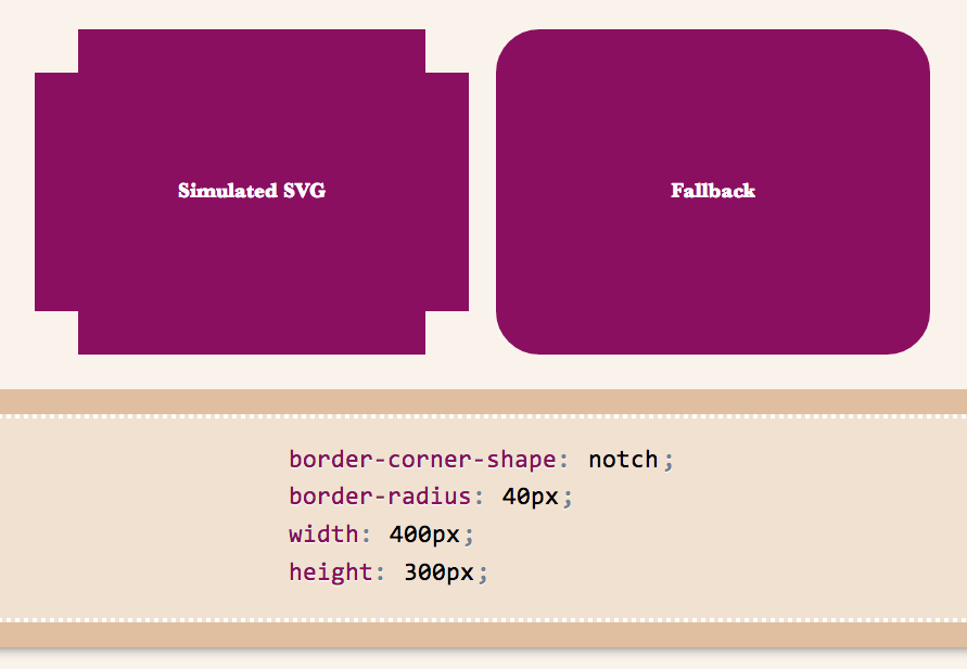
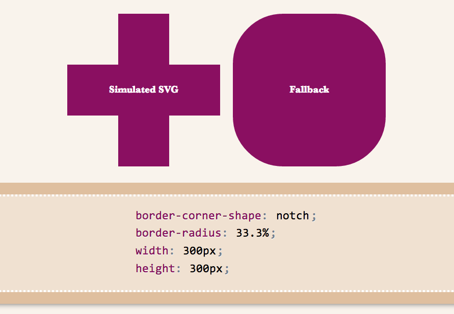
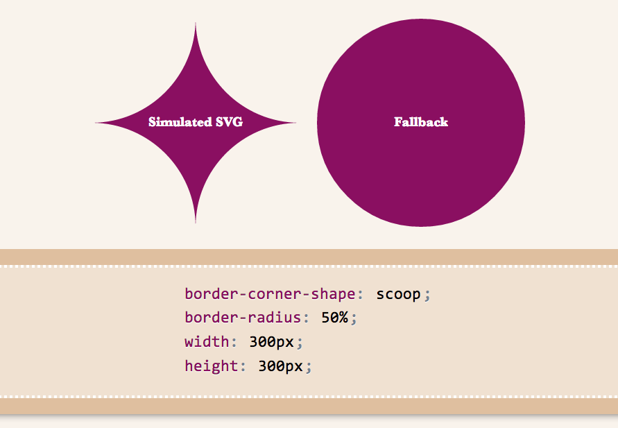
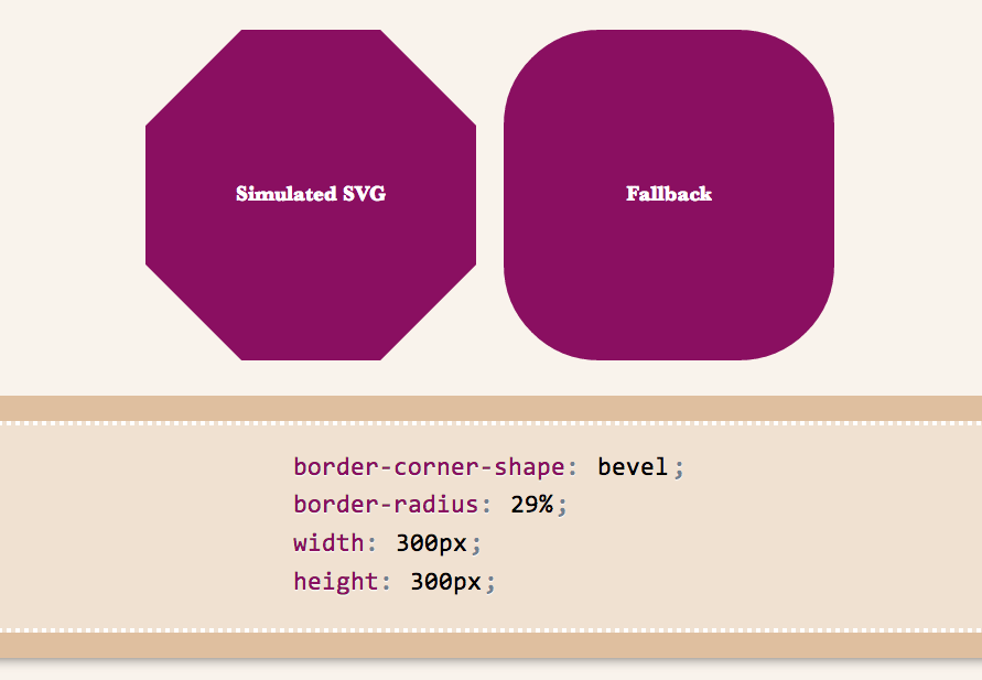
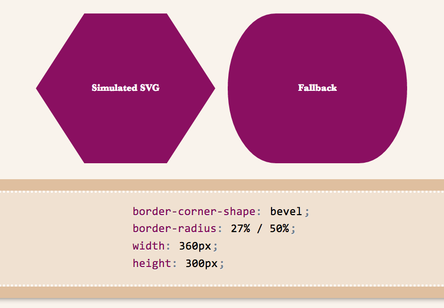
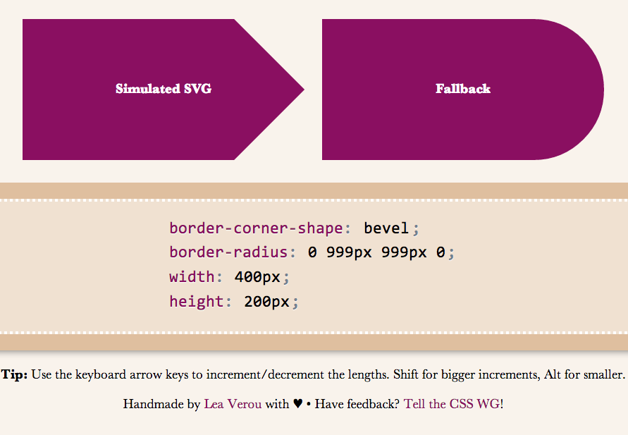
Below are a few examples of shapes:

bevel-1scoop-1notch-1 notch-2 scoop-2 bevel-4 bevel-3 bevel-2

I wanted to demo triangles and trapezoids as well, but it seems there’s a bug in my app, so I’ll have to debug it first :( If we allow border-corner-shape to have different values for all four corners, even more possibilites open (e.g. arrows).

Spend a few minutes to help the CSS WG help you. Thanks!


Easily center text vertically, with SVG!

2 min read 0 comments Report broken page

These days, we have a number of different ways to vertically align text in a container of variable dimensions:

  • Table display modes
  • Flexbox
  • inline-block hacks
  • Wrapping the text in an extra element and absolutely positioning it
  • …and probably many others I’m forgetting

However, often comes a time when neither is suitable, so here I am, adding yet another option to the list. Of course, it comes with its own set of drawbacks, but there are cases where it might be better than the existing solutions.

It all started when I discovered the text-anchor SVG property. It determines where the x and y attributes on <text> elements refer to. The magic starts when you set it to “middle”, then the x and y attributes refer to the center of the text. So, if you set those to 50%, they refer to the center of the SVG graphic itself, and if you set the SVG width and height to 100%, the text basically sits in the center of the <svg>’s container, which could be any HTML element!

One issue was that this centered the baseline of the text, so I tried to find a way to shift the baseline appropriately. Setting dominant-baseline: middle; on the ```](http://www.w3.org/TR/SVG/text.html#TextElement) element seemed to fix it, but it looks like IE doesn’t support that. I ended up adding [`dy`](http://www.w3.org/TR/SVG/text.html#TextElementDYAttribute)=“.3em” to the [`` element, which fixes it but might need to be adjusted if you change the line-height.

In addition, this method has the following drawbacks I can think of:

  • Extra markup (namely 2 elements: <svg> and <text>)
  • If the text is more than one line, it won’t automatically wrap, you have to do it manually.
  • Some new-ish CSS text properties may not be applied. For example, text-shadow is applied in Chrome but not in Firefox, since technically, it’s still not a part of the SVG spec.
  • You need to duplicate the text color as a fill property, since SVG does not understand the color CSS property. No need to duplicate anything, just use fill: currentColor; (thanks GreLI!)

However, it has a few advantages too:

  • You don’t need to change anything on the parent HTML element
  • Degrades gracefully in non-SVG browsers
  • Should be perfectly accessible and won’t break SEO
  • Works perfectly in IE9, unlike Flexbox
  • You can include any kind of SVG styling on the text. For example, strokes!

You can see and play with the result in the dabblet below:

Verified to work in at least Chrome, Firefox, IE9+. Hope it’s useful, even though it won’t be a good fit in every single use case.


Preview corner-shape, before implementations!

1 min read 0 comments Report broken page

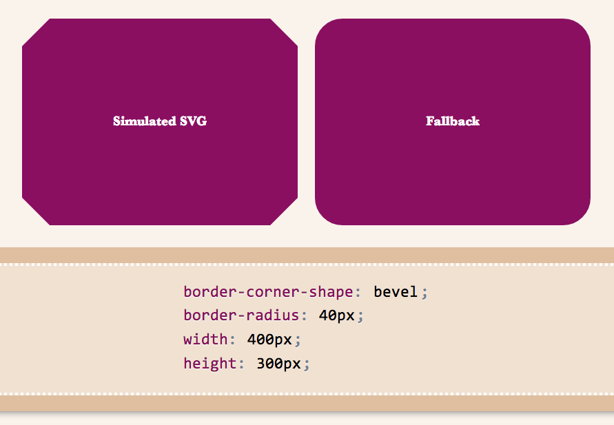
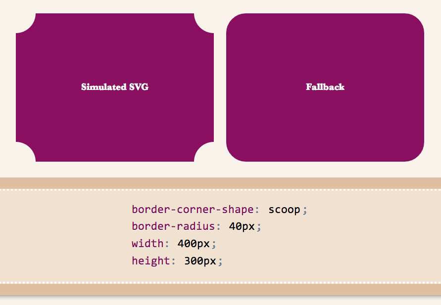
As an editor of the Backgrounds & Borders Level 4 spec, I am naturally a bit more interested in the cool features it will bring, once implementations start (it’s currently too early for that). One of the coolest features in it is corner-shape. While in Backgrounds & Borders 3, border-radius was only used for rounded (actually, elliptical) corners, with the help of corner-shape, it will be able to do so much more! Beveled corners, scoop-style corners (informally known as “negative border-radius”), even rectangular notches.

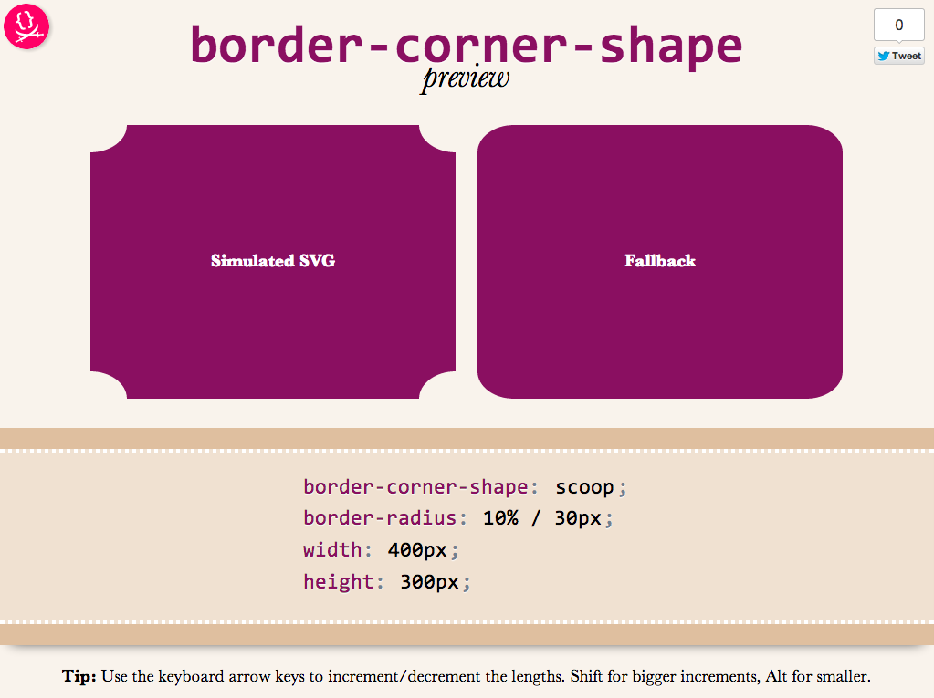
Unfortunately, until it’s implemented in browsers, it’s hard to play with it. Or, is it? I spent the weekend creating an app in which you can enter values for corner-shape, border-radius, width, and height, and see the result, simulated through SVG, as well as the fallback in browsers that don’t support border-corner-radius (which is currently all browsers).

corner-shape preview

Obviously, it’s not a full preview, since you can only play with a limited subset of CSS properties, but it should be good for seeing the kinds of shapes that will be possible.You could also copy the generated SVG from the Developer tools of your browser, and use it as a background in any website!

Use it here: corner-shape preview

Tested to work in at least Chrome, IE9, Firefox, Safari and theoretically, should work in any SVG-enabled browser.

Enjoy! Hope you like it.

Important: Please note that corner-shape is still at a very early stage and might completely change before implementations. You can also help to make it better: Play with it and comment on what you think about its naming and functionality!


Use MathML today, with CSS fallback!

2 min read 0 comments Report broken page

These days, I’m working on the slides for my next talk, “The humble border-radius”. It will be about how much work is put into CSS features that superficially look as simple as border-radius, as well as what advances are in store for it in CSS Backgrounds & Borders 4 (of which I’m an editor). It will be fantastic and you should come, but this post is not about my talk.

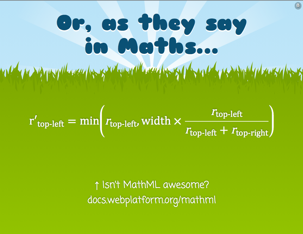
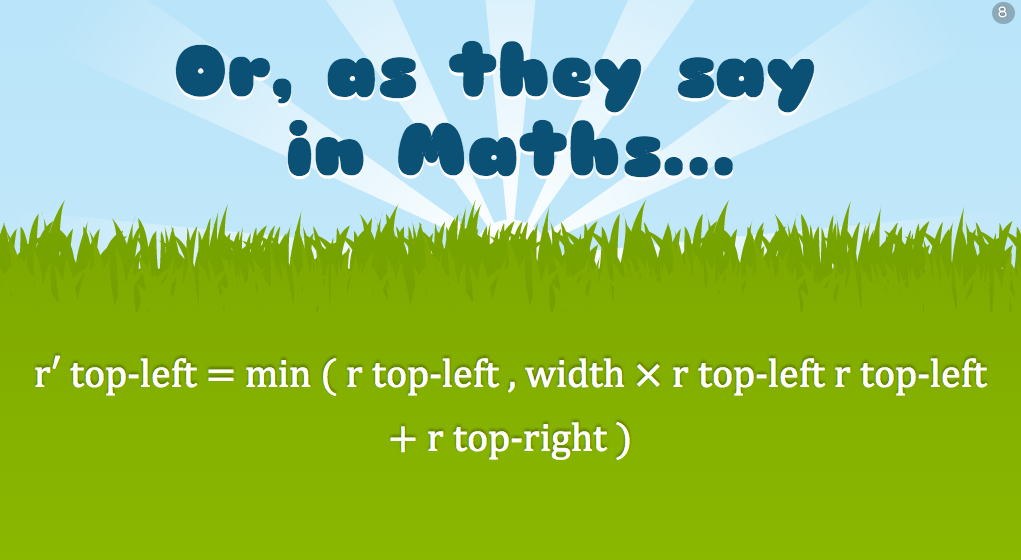
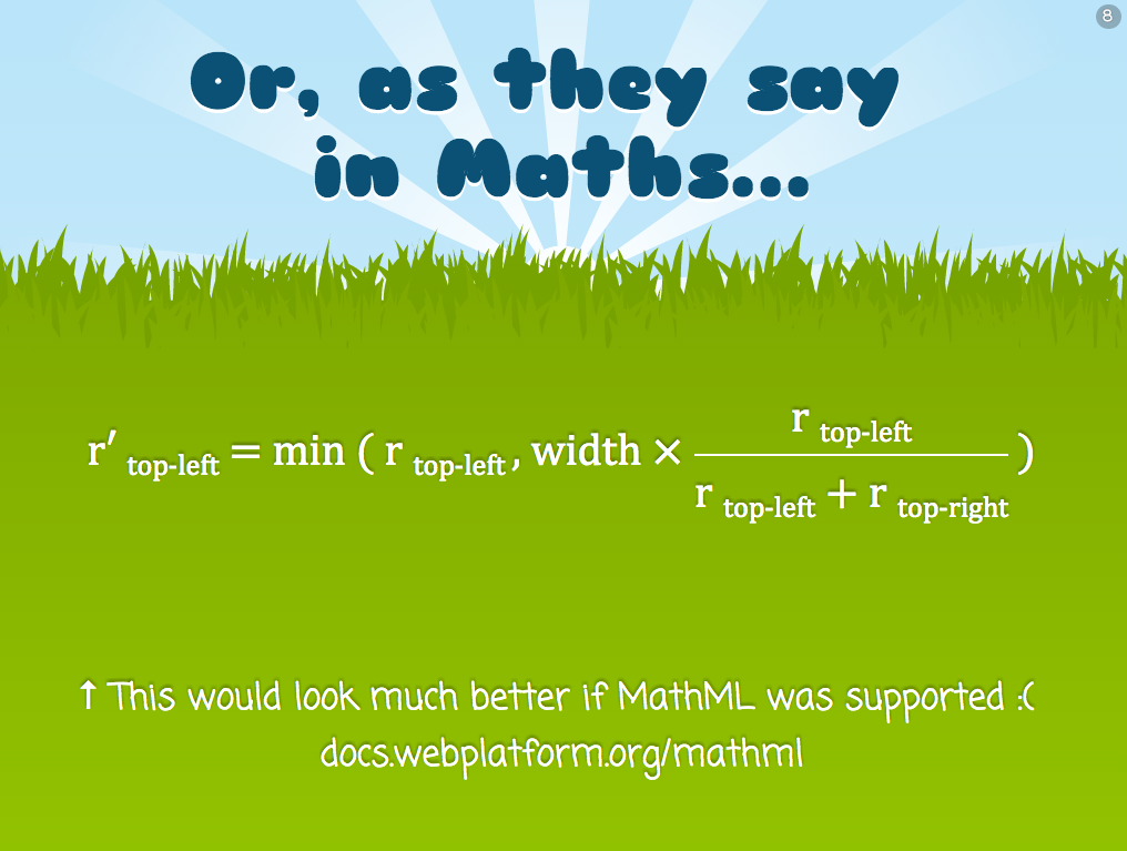
As you may know, my slides are made with HTML, CSS & JavaScript. At some point, I wanted to insert an equation to show how border-top-left-radius (as an example) shrinks proportionally when the sum of radii on the top side exceeds the width of the element. I don’t like LaTeX because it produces bitmap images that don’t scale and is inaccessible. The obvious open standard to use was MathML, and it can even be directly embedded in HTML5 without all the XML cruft, just like SVG. I had never written MathML before, but after a bit of reading and poking around existing samples, I managed to write the following MathML code:

<math display="block">
    <mrow>
        <msub>
            <mi>r&prime;</mi>
            <mi>top-left</mi>
        </msub>
        <mo>=</mo>
        <mi>min</mi>
        <mo>(</mo>
        <msub>
            <mi>r</mi>
            <mrow>
                <mi>top-left</mi>
            </mrow>
        </msub>
        <mo>,</mo>
        <mi>width</mi>
        <mo>&times;</mo>
        <mfrac>
            <mrow>
                <msub>
                    <mi>r</mi>
                    <mi>top-left</mi>
                </msub>
            </mrow>
            <mrow>
                <msub>
                    <mi>r</mi>
                    <mi>top-left</mi>
                </msub>
                <mo>+</mo>
                <msub>
                    <mi>r</mi>
                    <mi>top-right</mi>
                </msub>
            </mrow>
        </mfrac>
        <mo>)</mo>
    </mrow>
</math>

I was very proud of myself. My first MathML equation! It’s actually pretty simple when you get the hang of it: <mi> is for identifiers, <mo> for operators and those are used everywhere. For more complex stuff, there’s <mfrac> for fractions (along with <mrow> to denote the rows), <msqrt> for square roots and so on.

It looked very nice on Firefox, especially after I applied Cambria Math to it instead of the default Times-ish font:

MathML native support in Firefox

However, I soon realized that as awesome as MathML might be, not not all browsers had seen the light. IE10 and Chrome are the most notable offenders. It looked like an unreadable mess in Chrome:

MathML in Chrome, with no CSS fallback

There are libraries to make it work cross-browser, the most popular of which is MathJax. However, this was pretty big for my needs, I just wanted one simple equation in one goddamn slide. It would be like using a chainsaw to cut a slice of bread!

The solution I decided to go with was to use Modernizr to detect MathML support, since apparently it’s not simple at all. Then, I used the .no-mathml class in conjunction with selectors that target the MathML elements, to mimic proper styling with simple CSS. It’s not a complete CSS library by any means, I just covered what I needed for that particular equation and tried to write it in a generic way, so that if I need it in future equations, I only have to add rules. Here’s a screenshot of the result in Chrome:

MathML in Chrome with CSS fallback

It doesn’t look as good as Firefox, but it’s decent. You can see the CSS rules I used in the following Dabblet:

Obviously it’s not a complete MathML-to-CSS library, if one is even possible, but it works well for my use case. If I have to use more MathML features, I’d write more CSS rules. The intention of this post is not to provide a CSS framework to use as a MathML fallback, but to show you a solution you could adapt to your needs. Hope it helps!


iOS 6 switch style checkboxes with pure CSS

2 min read 0 comments Report broken page

I recently found myself looking at the Tools switch in Espresso:

Not because I was going to use it (I rarely do), but because I started wondering what would be the best way to replicate this effect in CSS. I set on to create something that adhered to the following rules:

  1. It should be keyboard accessible
  2. It should work in as many browsers as possible and degrade gracefully to a plain checkbox in the rest
  3. It shouldn’t depend on pseudo-elements in replaced elements (such as checkboxes), since that’s non-standard so not very dependable
  4. It shouldn’t require any extra HTML elements
  5. It shouldn’t use JS, unless perhaps to generate HTML that could be written by hand if the author wishes to do so.

Why you may ask? Some of them are good practices in general, and the rest make it easier to reuse the component (and they made it more challenging too!).

The best idea I came up with was to use a radial gradient for the knob and animate its background-position. All that on a checkbox. After a lot of tweaking, I settled on something that looked decent (although not as good as the Espresso one) in the browser I was using (Chrome) and went ahead to test it in others. The result was disappointing: I had forgotten that not all browsers allow that kind of customization on checkboxes. And who can blame them? This is what happens when you’re wandering in Undefined Behavior Land. They are not violating any spec, because there is no spec mandating or forbidding checkboxes from being stylable with CSS and to what extent, so every browser does its thing there.

Here you can see my failed attempt, which only works as intended in Chrome:

I realized I had to lift one of the restrictions if I wanted to solve this, so I picked the 4th (no extra HTML elements), as it was the least important one. I could have done it as a pseudoelements on <label>s, but I decided to use a <div> instead, for maximum flexibility. The <div> is added through script in the Dabblet below, but it could be added by hand instead.

To get around the limitation of pseudo-elements not being animatable in current and older versions of WebKit, I animate the padding of the <div> instead.

And then I thought, why not make iOS-style switches? Even more challenging! I turned on my iPhone and tried to replicate the look. Adding the ON/OFF text was very painful, as it needs to both animate and be styled differently for “ON” and “OFF”. Eventually, I ended up doing it with text-indent in such a way that it depends on the knob’s position, so that when the knob animates, the text moves too.

Another challenge with this was the different backgrounds. Changing the background color upon :checked was not enough, since it needs to slide as well, not just abruptly change or fade in. I ended up doing it with a gradient and animating its background-position. Naturally, this makes it not look as good in IE9.

So, without further ado, here is the final result:

Yes, I know there are other efforts on the web to replicate this effect with pure CSS, but none of them seems to come as close to the original, without images and with such minimal HTML.

Why bother, you may ask? Well, it was a fun pastime during SXSW breaks or sessions that turned out to be less interesting than expected or in the plane on the way home. Besides, I think that it could be useful in some cases, perhaps if the styling is tweaked to not resemble iOS too obviously or maybe in iOS app mockups or something.

Enjoy!

Credits to Ryan Seddon for paving the way for custom form elements through CSS, a couple years ago


W3Conf in San Francisco, February 21-22

1 min read 0 comments Report broken page

You might have heard about W3Conf, W3C’s conference for web designers and developers. This year, I have the pleasure of not only speaking there but also organizing it, along with Doug Schepers and designing the website for it.

Alongside with yours truly, it features an excellent lineup of amazing speakers like Eric Meyer, Alexis Deveria of caniuse.com fame, Nicolas Gallagher and many others. You can use coupon code VEROU to get $100 off the already affordable Early Bird price of $300. But hurry up, cause Early Bird prices are only valid until January 31st!

Hope to see you there!


One year of pastries

6 min read 0 comments Report broken page

Last September, I was approached by Alex Duloz, who invited me to take part in his ambitious new venture, The Pastry Box Project. Its goal was to gather 30 people (“bakers”) every year who are influential in their field and ask them to share twelve thoughts — one per month. For 2012, that field would be the Web. I was honored by the invitation and accepted without a second thought (no pun intended). The project was quite successful and recently we all (almost) agreed for The Pastry Box Project to become a book, whose profits will be donated to charity.

The initial goal of the project was to gather thoughts somehow related to the bakers’ work. Although many stuck to that topic, for many others it quickly drifted away from that, with them often sending thoughts that were general musings about their lives or life in general. For me …well lets just say I was never good at sticking to the topic at hand. ;)

The Pastry Box showed me that I want a personal blog so I made one today. I will still publish personal stuff here, as long as it’s even remotely web-related, so not much will change. However, my interests range to more than the Web, so I will now have another medium to express myself in. :)

Since 2012 is now over, I decided to gather all my “pastries” and publish them in two blog posts: I will post the more techy/professional ones below and the more general/personal ones in my personal blog. Since most of them were somewhere in the middle, it wasn’t easy to pick which ones to publish where. I figured the best solution is to allow for some overlap and publish most of them in both blogs.

January

Often people ask me how I come up with the new ideas I publish. I think my main “differentiator” is that I try not to be restricted by my knowledge about what’s possible and what is not. I first think about what I want to make (for example “I want to do a rating widget with pure CSS”) and then I investigate how it could be done. And I don’t give up easily. Sometimes it even takes months having the question in the back of my head before I come up with a solution.

People push the boundaries of what’s achievable with web technologies every day. Do you want to be one of them, or do you want to be stuck repeating what’s been done over and over again until you get sick of it? Don’t be afraid to try new things. If a voice inside you screams “That isn’t possible!”, ignore it. In most cases, this voice is wrong.

February

You may catch more flies with honey than with vinegar, but you catch even more with a little audacity. Being polite is a good rule of thumb, but like everything, it also needs moderation. Don’t say “share my content pleeeeeeaaaase”. It makes people think your content isn’t worthy of sharing if you have to grovel. In a long email, don’t write a paragraph apologizing for its length (true story!). Being overly polite when meeting someone, categorizes yourself as inferior in the other person’s subconscious. Treat yourself with the respect and admiration you expect from other people. If you don’t think highly of yourself, nobody will. When meeting someone you admire, treat them as an equal and they’re more likely to do the same.

However, be careful not to cross the fine distinction between treating yourself with respect and being a cocky jackass. Treat others as equals, not as inferiors, otherwise your attitude will get you nowhere — and will piss everyone off along the way.

March

You can get quite far by putting cool stuff out there and expecting everything to come to you. Yes, you will eventually get job offers, conference invitations and various distinctions. However, sometimes, just asking will get you what you want much faster.

I used to avoid asking like the plague, and thought that if my work is good enough, what I want will naturally come to me. Which makes sense, to a certain extent: When someone keeps asking for stuff all the time, you can’t help but think that they merely see you as means to an end.

However, when you really want something, it never hurts to approach it yourself. Lately, I’ve been experiencing how much easier this makes things, and I’d strongly recommend you try it too. Turns out that quite often you don’t have what you want not because you aren’t good enough, but because the parties involved have no idea you’re interested.

April

The best argument against conventional wisdom is the fate of everyone following it. If you aspire beyond mediocrity, conventional wisdom is recipe for failure. Think out of the box. What can you do to achieve your goals, that others are not already doing? The least popular paths are the most successful. The trick isn’t doing better than the others, it’s minimizing the number of “others”. Find unexplored territory and make it yours. It’s much easier than trying to claim your stake on someone else’s land.

May

I never make long-term plans. Life is an unpredictable adventure. Concrete plans restrict this amazing journey. Stressing over a series of mental checkboxes you need to check until a certain date shifts your focus away from making awesomeness. I have long-term dreams instead, and they are all the compass I need. They give me the drive to constantly strive to improve, while still allowing room for surprises. I learned to trust chaos, and so far, I was never disappointed.

June

Contrary to popular belief, the defining characteristic of a good professional, in any discipline, is not the ability to blurt out good ideas off the top of their head. It’s perseverance and not being easily satisfied. Where the others would stop, they keep going. For example, when writing CSS, they won’t stop after they’ve achieved a certain style. They will also try to make it more flexible, more maintainable, simpler. Next week, try this: When you’re about to give up and proclaim that something is “done”, try to spend five more minutes on the task, thinking how you can improve it further, how to make it more elegant. I think it will help you be much more satisfied and proud of your work.

July

Before you start complaining about what you don’t like in CSS, HTML or JavaScript, ask yourself: How would I do it better? Sometimes, the things that bother us are just unavoidably subpar solutions to very hard problems. It sounds obvious, but many people I’ve spoken with get a completely new perspective when they ask themselves this question. Also, there are many other factors affecting design choices, beyond syntactical elegance and ease of understanding. For example, making implementations easier, maintaining backwards compatibility or matching what browsers already do. Sometimes that “obvious better solution” is just not possible in practice.

August

We all teach from time to time, whether it’s explaining something to a colleague, writing a blog post about the cool CSS technique we discovered, or giving a technical talk. If you are serious about becoming better at it, I’d strongly recommend reading up on psychology and neuroscience. If you don’t have the time to, here’s one fact that I’ve found most useful: Humans have incredibly impressive pattern recognition skills. We use them in pretty much everything we do, from learning our native language as kids, to escaping predators in the wild.

How does that help you teach more effectively? In one word: Examples, examples, examples. No matter how good you are at explaining the rules, nothing beats a few good examples of their application in practice. Our abstract thinking is not nearly as good as our pattern recognition skills.

However, don’t be fooled into thinking that theory is useless. Often, multiple explanations fit a given example. The theory helps us pick the one that fits, which might not be the one we initially recognized.

I’ve found that this principle applies to pretty much everything I’ve taught or have been taught, from mathematics to natural and programming languages. You can forget the theory, but you should never forget the examples.

September

People often think it’s hard to change my mind, that I’m too fixated on my own opinions. The reason I give this impression is that I will fiercely defend them. However, I will only do so until I see compelling arguments for the other side. I always try to keep an open mind to being wrong, and it has only made me better.

In the past few months I’ve been witnessing myself slowly change my views regarding yet another major life issue: The place I want to live in. Moving to the US has been a life goal for me ever since I first visited, almost fifteen years ago. However, as I spend more time there and get closer to moving, I’ve started noticing things that I don’t like so much. I’ve tried to ignore them, but they keep being there, giving me the finger like dead pixels on a brand new screen. I might go forward with it anyway, or I might pick another country, but this is yet another experience that has taught me to avoid being dogmatic.

We are all, and should be, subject to change. Whoever insists in their rigid convictions reminds me of software whose bugs never get fixed. You are the only maintainer of that software. Be vigilant enough to discover and fix your own bugs. Be open-minded enough to listen to other people’s bug reports about it. Most people forget to do this after a certain age. They become so arrogant that they think they don’t have any more bugs to fix, or so insecure that they believe they can’t fix any more. That’s the turning point where the years that pass by start to become “aging”, instead of “growing up”. Aging doesn’t have to do with how long you’re on this planet, it has to do with giving up on yourself. To stop being subject to change is to start being stagnant.

October

These days, we almost all unequivocally embrace graceful degradation and progressive enhancement. It’s the extent that people disagree on, since everyone has a different definition of what is “graceful” and what is “enhancement”. Is a solid color an acceptable fallback for a pattern? What if your lightbox has no overlay? What if your stripes become a solid color? What if your transitions are not there? What if your code has no syntax highlighting? That’s the true challenge: How different can they look? Is it sufficient if the content is accessible in IE8 or does it also have to be pretty? How pretty? Those are the questions you need to agree on with your team to ensure you’re all on the same page. An agreement on the basic premise that websites don’t have to look the same in every browser is far from enough. Graceful degradation is not black & white, it’s a spectrum. You need to find where you lie on that spectrum and where your colleagues lie on it too, otherwise expect a lot of tension every time decisions need to be made.

CSS Animations with only one keyframe

2 min read 0 comments Report broken page

This is a very quick tip, about a pet peeve of mine in almost every CSS animation I see. As you may know, I’m a sucker for reducing the amount of code (as long as it remains human readable of course). I demonstrated a very similar example in my “CSS in the 4th dimension” talk, but I recently realized I never blogged about it (or seen anyone else do so).

Lets assume you have a simple animation of a pounding heart, like so:

@keyframes pound {
	from { transform: none; }
	50% { transform: scale(1.4); }
	to { transform: none; }
}

.heart { /* … */ animation: pound .5s infinite; }

You can see the problem already: the shrunk heart state is repeated twice in the keyframes (from and to). You probably know you can combine them into one rule, like so:

@keyframes pound {
	from, to { transform: none; }
	50% { transform: scale(1.4); }
}

What many don’t know, is that you don’t need these two keyframes at all, since they basically replicate the same state as the one in the .heart rule. To quote the CSS Animations spec:

If a 0% or “from” keyframe is not specified, then the user agent constructs a 0% keyframe using the computed values of the properties being animated. If a 100% or “to” keyframe is not specified, then the user agent constructs a 100% keyframe using the computed values of the properties being animated.

Therefore, the code could actually be as simple as:

@keyframes pound {
	50% { transform: scale(1.4); }
}

This trick is very useful for providing fallbacks that are the same as the first or last keyframe, without having to repeat them in the @keyframes rule. Of course it doesn’t only apply to animations where you only have one keyframe beyond from and/or to. You can omit the from and to keyframes in every animation, when you want them to be the same as the styles that are applied to the element anyway.

Of course, to make this particular animation appear more natural, it would be much more wise to do something like this, still with only one keyframe (the from state is dynamically generated by the browser):

@keyframes pound {
	to { transform: scale(1.4); }
}

.heart { /* … */ animation: pound .25s infinite alternate; }

which just reverses every even iteration, instead of trying to have both states (shrinking and growing) in the animation. The reason this looks more natural is that animation-direction: alternate; (which is what the alternate keyword does in the animation shorthand) also reverses the timing (easing) function for the reversed iterations. ;)


Lots of improvements coming to dabblet

1 min read 0 comments Report broken page

I posted about this in both the WebPlatform.org blog and Dabblet’s blog, but I thought it might be interesting to many readers of this blog as well:

As many of you probably know, I’ve started working for W3C Developer Relations since this August. Half of my time is devoted to WebPlatform.org, a very promising project to document the web with the help of all major players, in a vendor-neutral way. Even before I joined W3C, we discussed using a hosted, customized version of dabblet in WebPlatform.org, as a platform for live code examples. I recently started working towards making this happen.

A lot of changes and improvements need to be made to achieve this, but the good news is, most of these will be pushed to dabblet.com as well! In a nutshell, this is what I’m currently working on:

  • Adding JavaScript support — This will be a challenge UX-wise, as it shouldn’t run on every keystroke, like the HTML and CSS, but it should run on startup and it should be straight-forward how to get it to run. Perhaps it will also run after a significant pause in typing.
  • Dabblets that are not stored in Github, but get their data through POST requests.
  • Improving cross-browser support
  • Strengthening security
  • Integrating Prism. Dabblet’s syntax highlighter might have been Prism’s precursor, but currently Prism has solved many of its bugs, and these fixes need to be pushed to dabblet at some point.
  • General bug fixing

These will probably be gradually rolled out in dabblet.com and tested by the community, before we integrate dabblet into WebPlatform.org. If a new feature is significant enough, there will be a new blog post about it here, but don’t expect blog posts about bugfixes. I’m really excited to see dabblet flourish, and I believe you will be too, once these updates are out!


Easy color contrast ratios

2 min read 0 comments Report broken page

I was always interested in accessibility, but I never had to comply with any guidelines before. At W3C, accessibility is considered very important, so everything we make needs to pass WCAG 2.0 AA level. Therefore, I found myself calculating color contrast ratios very frequently. It was a very enlightening experience. I used to think that WCAG-mandated contrast ratios were too restrictive and basically tried to force you to use black and white, a sentiment shared by many designers I’ve spoken to. Surprisingly, in practice, I found that in most cases they are very reasonable: When a color combination doesn’t pass WCAG, it usually *is* hard to read. After all, the possible range for a contrast ratio is 1-21 but only ratios lower than 3 don’t pass WCAG AA (4.5 if you have smaller, non-bold text). So, effectively 90% of combinations will pass (82.5% for smaller, non-bold text).

There are plenty of tools out there for this. However, I found that my workflow for checking a contrast ratio with them was far from ideal. I had to convert my CSS colors to hex notation (which I don’t often use myself anymore), check the contrast ratio, then adjust the colors as necessary, covert again etc. In addition, I had to adjust the lightness of the colors with a blindfold, without being able to see the difference my adjustments would make to the contrast ratio. When using semi-transparent colors, it was even worse: Since WCAG only describes an algorithm for opaque colors, all contrast tools only expect that. So, I had to calculate the resulting opaque colors after alpha blending had taken place. After doing that for a few days, I got so fed up that I decided to make my own tool.

In addition, I discovered that there was no documented way of calculating the contrast ratio range that can be produced with a semi-transparent background, so I came up with an algorithm (after many successive failures to find the range intuitively), published it in the w3c-wai-ig mailing list and used the algorithm in my app, effectively making it the first one that can accept semi-transparent colors. If your math is less rusty than mine, I’d appreciate any feedback on my reasoning there.

Below is a list of features that make this tool unique for calculating color contrast ratios:

  • Accepts any CSS color the browser does, not just hex colors. To do this, it defers parsing of the color to the browser, and queries the computed style, which is always rgb() or rgba() with 0-255 ranges which be parsed much more easily than the multitude of different formats than modern browsers accept (and the even more that are coming in the future).
  • Updates as you type, when what you’ve typed can be parsed as a valid CSS color.
  • Accepts semi transparent colors. For semi-transparent backgrounds, the contrast ratio is presented with an error margin, since it can vary depending on the backdrop. In that case, the result circle will not have a solid background, but a visualization of the different possible results and their likelihood (see screenshot).
  • You can share your results by sharing the URL. The URL hashes have a reasonable structure of the form #foreground-on-background, e.g. #black-on-yellow so you can even adjust the URL as a form of input.
  • You can adjust the color by incrementing or decrementing its components with the keyboard arrow keys until you get the contrast right. This is achieved by including my Incrementable library.

Browser support is IE10 and modern versions of Firefox, Safari, Chrome, Opera. Basic support for IE9. No responsive version yet, sorry (but you can always send pull requests!)

Save the link: contrast-ratio.com

Edit 2022: Link updated to reflect current one. Original link was leaverou.github.com/contrast-ratio


Dive deep into CSS3 (and Bolognese!) in Bologna, Italy

1 min read 0 comments Report broken page

I don’t usually like to advertise my talks or workshops through blog posts, and even though I’ve given a lot, I’ve only posted about less a handful. However, this one is special: It might be my last. Don’t get me wrong: I LOVE giving workshops, teaching people new things and seeing them put them in use right away is fantastic. However, I also find them incredibly exhausting. Speaking for an entire day (or sometimes two!) is pretty much the most tiring thing I’ve done. So, given my new job at W3C, I’m not sure if I will do one again. Of course, it goes without saying that I will still do plenty of talks! :)

The last workshop on my schedule is in FromTheFront conference in Bologna, Italy on September 20th (in 7 days!). There are still some spots available, so grab yours while you still can! It only costs €329.00. It will be very hands-on, with interactive exercises that help you gain first-hand experience with small but advanced use cases. It will not be your usual CSS3-overview kind of workshop. Instead, we will dive really deep into a handful of CSS3 aspects that I think are most useful for your everyday work.

While you’re at it, I’d also recommend getting a conference ticket as well. The line-up has some excellent speakers and it’s only €110 more, so totally worth it!

Apologies that my last two blog posts were personal, the next one will be more technical: I have a very useful tool in the pipeline that I’m gonna release soon ;)


lea@w3․org

2 min read 0 comments Report broken page

In my recent post describing how I got into web development I wrote that I’m in the verge of some big changes in my life. The main one of them starts tomorrow. As of tomorrow, the above will be my professional email. Yes, you guessed it right; I’m joining the W3C team! Yes, the same W3C you all know and love :) I decided to title this blog post with it, as I like how a 10 letter string manages to neatly summarize so much.

Working at W3C had been a dream of mine ever since I learned what a web standard is. As you probably know if you’ve been following my work, I’m a strong believer in open web standards. Even though proprietary technology might offer some short term benefits, in the long run only open standards can allow the Web to reach its full potential.

I’d like to especially thank the two people below (in chronological order). If it wasn’t for them, this dream would have never materialized:

  • Oli Studholme: I still remember our IRC conversation back in January. I was telling him how much I’d love to work for W3C, but “I’m not that good”. He repeatedly encouraged me to contact W3C and express my interest, despite my strong reluctance to do so. “Don’t be like the 15 year old boy that is too shy to ask the girl out” was the argument that finally convinced me. He even asked around to find which person I should contact.
  • Doug Schepers: If it wasn’t for Doug’s heroic efforts, this would have never happened. He believed in me from the start and did everything he could to for this to go through. He spent an incredible amount of time trying to help me, although I repeatedly bombarded him with a cornucopia of silly questions. :) Over the course of these 6 months, he didn’t just become a colleague, but also a friend.

Thank you both. I’m deeply grateful.

I will be part of the W3C developer relations and web education efforts, working a lot with Doug (aka @shepazu). In practice, this means:

  • Help developers understand where standards are headed, and solicit early feedback on upcoming features.
  • Help Working Groups understand what developers need.
  • Help plan W3C developer events, including conferences
  • Speaking about open web technologies at conferences and other events
  • Writing articles and documentation about open web technologies
  • Making demos and tools that demonstrate and help authors understand web standards

In addition, I will be helping with the design of many W3C-related things, as I will be the only designer at W3C.

As you can see I’ll be wearing many hats, which is exactly what I love about this role! I had many tempting offers from big US companies that offered salaries with more digits and a lot of perks. However, my heart wanted W3C and this role was practically tailored to my talents and interests.

I’m honored to be a part of W3C and I’m looking forward to helping out.

<voice type="fangirl">I have to admit I’m also really looking forward to meeting Sir Tim Berners-Lee in person! :D</voice>


Introducing Prism: An awesome new syntax highlighter

2 min read 0 comments Report broken page

For the past three weeks, on and off, I’ve been working on releasing Dabblet’s syntax highlighter as standalone, since many people had requested it. Zachary Forrest  suggested the name “Prism” and I liked it so much I decided to go with it, even though there is an abandoned Mozilla project with the same name. I ended up refactoring and extending it so much that I will need to backport it to Dabblet one of these days! This doesn’t mean I bloated it, the core is still a tiny 1.5KB minified & gzipped. It just means it’s more awesome. :)

Seriously? The world needs another syntax highlighter?

In certain ways, Prism is better than any other syntax highlighter I’ve seen:

  • It’s tiny. The core is only 1.5KB minified & gzipped, which can go up to 2KB with the currently available language definitions (CSS, Markup and JS). But many other highlighters are also small, so read on.
  • It’s incredibly extensible. Not only it’s easy to add new languages (that’s a given with every syntax highlighter these days), but also to extend existing ones. Most importantly, it supports plugins, through hooks strategically placed in its source. There are a few plugins already available, and it’s really easy to write your own. I haven’t seen any other highlighter that supports plugins.
  • It encourages good author practices. Other highlighters encourage or even force you to use elements that are semantically wrong, like <pre> (on its own) or <script>. Prism forces you to use the only semantically correct element for marking up code: <code>. On its own for inline code, or inside a <pre> for blocks of code. In addition, the code language is declared through the way recommended in the HTML5 draft: through a language-xxxx class.
  • One of its best features: The language definition is inherited. This means that if multiple code snippets have the same language, you can just define it once, in one of their common ancestors. Obviously, if you define a language on the <body> element, you’ve essentially declared a default language for the entire document.
  • It looks good. All three of its existing themes. Most people wanted me to release Dabblet’s highlighter because they found other highlighters (including their themes) quite ugly.
  • It supports parallelism through Web Workers, for better performance in certain cases.
  • It doesn’t force you to use any Prism-specific markup, not even a Prism-specific class name, only standard markup you should be using anyway. So, you can just try it for a while, remove it if you don’t like it and leave no traces behind.

However, there are some limitations too:

  • Pre-existing HTML in the code block will be stripped off. However, there are plugins for links and highlighting certain lines.
  • I decided not to support IE8. Prism won’t break on IE8, it just won’t work. I don’t think many people using IE8 and below are able to read code, so I don’t see the point.

Enjoy: prismjs.com

If you like this project, don’t forget to follow @prismjs on Twitter!

I’ll soon update this blog to use Prism in the code examples as well.